
When Everything Is There… Except That Film Feeling
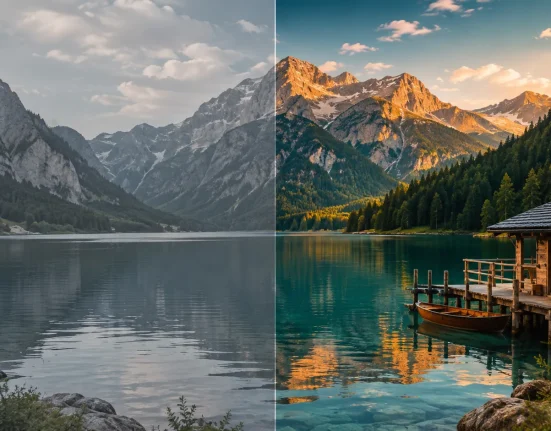
Have you played around with the JW Presets Kodak Potra? Sometimes a photo can be technically perfect… the lighting is right, focus is sharp, everything is in place. But when you look at it, you realize it lacks that warm, intimate feeling you want; it feels too digital and just “correctly taken,” not “emotional.”
If you love analog photography, you know exactly what’s missing—the soft warmth of colors, the gentle tones, and that real, nostalgic film feeling.
Sometimes, you spend hours in Lightroom—tweaking curves, adjusting colors, adding grain—but in the end, that stubborn film vibe just won’t come through, and the soul of the photo still feels incomplete.
This is why many photographers are looking for a clean, reliable shortcut—a way to bring the classic film mood to digital photos quickly, simply, and accurately, without endless trial and error.

How to Create Portra Looks Without Presets
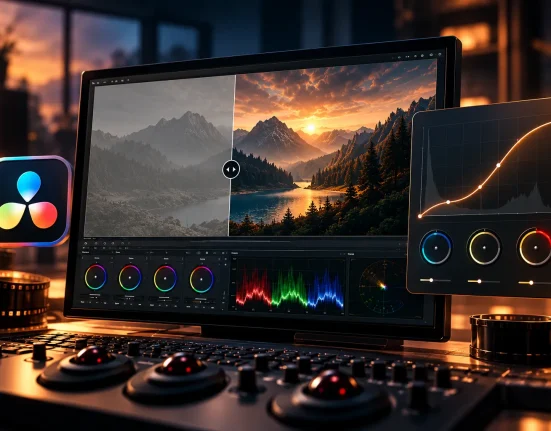
When you try to replicate the Portra film look without a preset, you have to adjust almost everything manually in Lightroom. The process is long, detailed, and includes several key steps:
Key Steps in Manual Editing
- Curves (RGB and Luminance): To create soft, balanced colors
- Tone Adjustments: Control overall brightness and contrast
- Split Toning / Color Grading: Add the warm, distinctive Portra tint
- Saturation and Luminance per Color: Prevent skin tones and natural colors from being ruined
- Grain Simulation: Add texture and an analog feel
- Vignette: Guide the viewer’s eye toward the main subject
- Natural Skin Look: Keep skin tones realistic
Problems with Manual Editing
- Time-consuming and tedious
- Results are always unpredictable
- Requires high skill and experience
- Achieving accurate Portra skin tones is challenging
- Repeating the same style across multiple projects is nearly impossible
This is why many prefer using professional presets—tools that act like precise, fast assistants, simplifying long, tedious manual steps into predictable, one-click solutions.
JW Presets Kodak Potra: The Professionals’ Shortcut
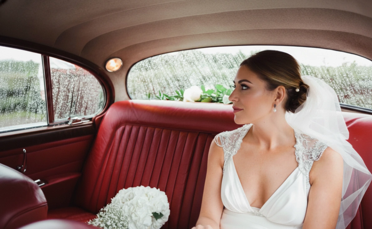
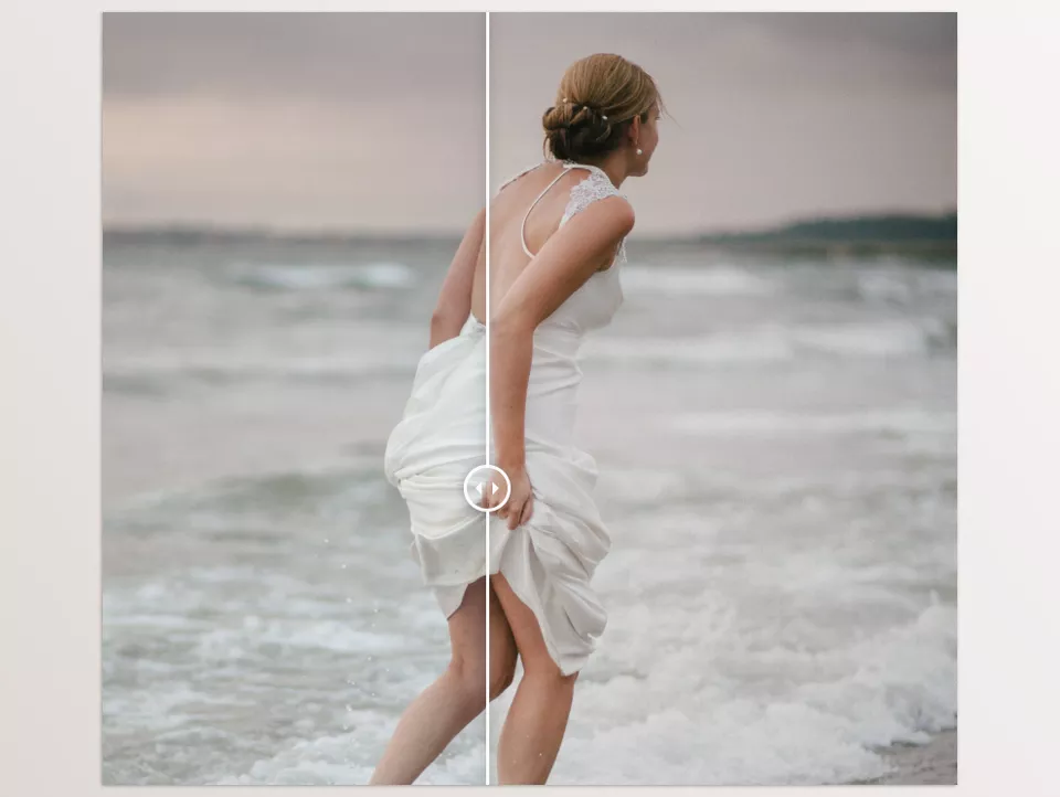
JW Presets Kodak Potra is a complete package of 15 film presets that replicate the authentic, warm look of Portra films on digital photos. Without hours of manual editing, your photos instantly gain a real analog feel. These presets preserve natural colors, tones, and skin warmth, giving projects a professional, cohesive look.
⭐ Accurate Portra Film Simulation
This set includes different Portra versions, each with its own color character:
- Portra 160
- Portra 400
- Portra 800
- Pulled / Pushed / Low Contrast / NC / VC / UC versions
Each preset is designed based on Portra’s standard brightness, contrast, and color tone to ensure natural, professional results for portraits, interiors, street photography, and landscapes.
🎛️ Helper Tools and Extras
This pack isn’t just presets—it also includes tools that make your workflow easier:
- 9 film frames ready to use in Lightroom for a realistic film feel
- 6 grain presets for natural, soft film texture
- 3 vignette presets to focus on the subject and create depth
- Scanned PNG frames for Photoshop to achieve authentic film looks with edge details, dust, and light leaks
🧩 Compatibility and Flexibility
Compatible with all major Adobe versions:
- Lightroom CC
- Lightroom Classic
- Photoshop CC
- Lightroom Mobile (via Creative Cloud Sync)
You can use them seamlessly on desktop or mobile, keeping styles consistent across platforms.
🎯 Why JW Presets Kodak Potra Is Easy and Professional
With these presets, you can:
- Save time on editing
- Achieve accurate, natural skin tones
- Create a consistent, professional style across projects
- Add real film frames in Photoshop with a single click
In short, everything is optimized so you can focus on your creativity and photography, not time-consuming manual adjustments.
💡 Pro Tip
JW Presets Kodak Potra are for those who want to turn ordinary digital photos into professional, cinematic film-style images without spending hours on curves and color grading—a precise, reliable shortcut that speeds up projects while keeping them cohesive and visually appealing.
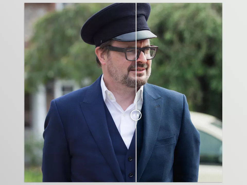
How to Get the Best Results from Presets
After choosing a preset, always adjust exposure first. Presets set the base color and tone, but final lighting is up to you. To make photos look natural and professional, follow these tips:
- For portraits, avoid excessive grain to keep skin texture natural
- If tones are slightly yellowed or colors unbalanced, tweak Temp/Tint for color balance
- Apply PNG frames only on the top layer and try the Multiply blend mode for a natural film look
- For a true film feel, slightly reduce Clarity or Texture on faces and main areas to maintain softness
- For street or landscape photos, slightly lower Saturation and Vibrance for a natural film look
- Use a gentle Tone Curve to adjust final contrast, balancing brightness and depth
- When preparing images for mobile or social media, export in high quality (RGB JPG) and keep frames on a separate layer for later edits
By following these simple tips, you can turn any preset into a professional, realistic result without hours of tweaking or artificial effects. This saves time while giving photos a true film-like look.
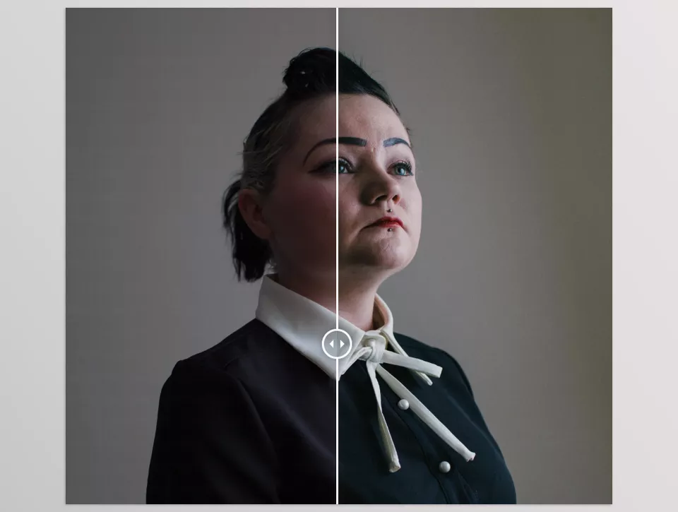
The Shortcut to Film Feeling
If you enjoy the warm, soft color aesthetic of Kodak Portra films, these presets are a quick, trustworthy, and professional solution for digital images that want that cinematic feel but are created in a much different atmosphere. Forget spending hours adjusting curves, color grading, and intricate settings. One click restores that film quality with authenticity and makes your images feel like they’ve been processed by a professional.
By trying JW Presets Kodak Potra, you’ll quickly understand why professional photographers always look for such shortcuts to create a consistent visual identity—a method that saves time and delivers the results you want without stress or hassle.
The main advantage is that in any project—portrait, landscape, street, or interior—everything becomes quick, cohesive, and professional, and your photos gain that charming, authentic film feeling. Once you try it, you won’t want to work without this shortcut, because not only do you get faster, more attractive results, but your photos truly feel alive and natural
If mastering color grading is something you’re aiming for, we’ve created a detailed article that explains all the key principles in a friendly, straightforward format. I highly suggest giving it a read—you’ll find it incredibly helpful.