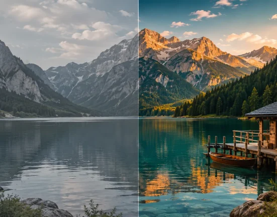

When Colors Need to Convey the Feel of a Classic Film 🎬
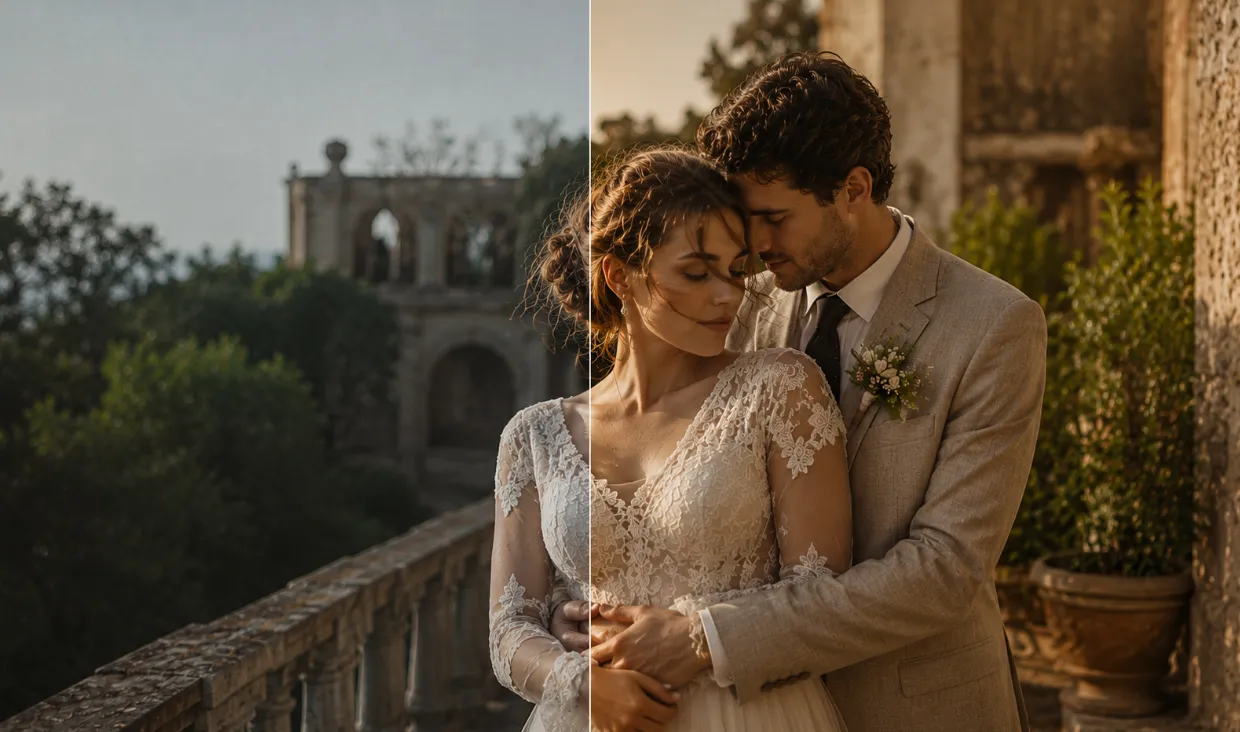
Have you ever experimented with the Marble LUTs by Gamut? Sometimes your footage is perfectly fine in lighting and quality, but it lacks that distinctive, consistent color palette that makes the image look more professional. For example, skin tones might be slightly warmer and creamier, greens might look clean, whites might retain their natural appearance, and the entire image might have a subtle, cinematic warmth.
Especially in projects like weddings, fashion, lifestyle, and cinematic films, color choices can change the mood of the entire video. In one case, earthy, dark colors create a luxurious, organic feel; elsewhere, bright, vibrant colors make the image look more modern. Even a warm black-and-white style can evoke the atmosphere of an old film.
The problem is that creating each of these Looks manually, especially when you have multiple shots, can take a lot of time. You have to constantly work with skin tones, greens, highlights, blacks, and contrast until you finally achieve the same soft, warm, cinematic appearance you had in mind from the beginning.

What Exactly Does a LUT Do? 🎨
A LUT, or Look-Up Table, in its simplest form, is a ready-made instruction for changing the colors of an image. Instead of starting from scratch with settings such as Contrast, Saturation, Temperature, and different colors for every project, you can apply a LUT to your footage and achieve a specific color appearance in just a few moments.
For example, imagine you have a wedding video and want the footage to look warm, soft, and slightly luxurious. Or perhaps you’re looking for deeper colors and more contrast for a promotional video. A LUT can be a great starting point for achieving that look.
Of course, the use of a LUT isn’t limited to changing the appearance of a single shot. When you have multiple shots from one project, using a LUT correctly can help the colors look more consistent and give the entire video a distinct visual identity.
If you’re not fully sure what a LUT actually does, you might want to check out our complete guide to color grading first.
Manual Methods for Creating These Looks 🎨
You can also achieve warm, cinematic, pastel, or black-and-white appearances without a LUT. Almost every professional editing and color grading software gives you the tools you need, allowing you to build the image’s color step by step. This process usually starts with basic image correction and then moves on to creating the color style.
- Color Wheels: For separately controlling shadows, Midtones, and highlights, and adding warmth to the image.
- Curves: For precisely adjusting contrast and changing specific colors, such as controlling greens or adding a warm tint to the highlights.
- HSL: For selecting and changing specific colors; for example, adjusting skin tones without heavily altering the rest of the image.
- Temperature and Tint: For creating warmth, coolness, or subtle tints across the entire image.
- Contrast and Saturation: For creating deeper, more vibrant, or softer and more pastel appearances.
When You Have to Repeat the Same Process for Dozens of Shots 😅
The main problem becomes apparent when you want to apply a specific Look to a large number of shots. A setting might look great on one shot, but on the next shot, differences in lighting, camera, or skin tone can produce a completely different result. As a result, you have to constantly adjust the settings and move back and forth between shots until everything looks consistent. If your goal is also a specific and subtle Look, such as warm and creamy colors, earthy and cinematic tones, or a pastel appearance, achieving the desired result manually can take a significant amount of time out of your editing process.
Marble: Five Color Styles for Creating a Professional Look 🎞️
Marble LUT Collection is a LUT collection focused on soft, warm, and stylish palettes, designed in collaboration with Flame Films. The main idea behind this collection is that instead of creating a complete Look from scratch, you have several ready-made color styles, each giving your footage a different character—from warm and creamy colors to earthy tones, bright and vibrant colors, a pastel appearance, and even black-and-white with the feel of classic films.
After purchase, you receive the .cube files as an instant download and can load them into your preferred NLE or color grading software. In total, the collection includes 5 main Primary LUTs, and each one also comes with an Isolated Color LUT and an Isolated Contrast LUT. This means that in addition to the five main Looks, you also have more control over separating the color and contrast components.
Marble 01: Creamy and Warm Skin Tones 🌸
Marble 01 is the closest option to the collection’s main and signature Look. This LUT focuses on creating warm, soft colors while preserving the image’s natural appearance. One of its most important changes is in skin tones: they shift toward creamy, blush colors, with a very subtle peach tint added to the image.
At the same time, this LUT doesn’t just warm up the skin. Greens remain clean and controlled, while whites retain their clean and stylish appearance. This combination makes the final result warm and visually pleasing without making the entire image excessively yellow or orange.
This Look is an attractive choice for projects where skin tones are especially important, such as wedding videos, portraits, fashion, lifestyle, and emotional films. If you’re looking for an image that is natural yet polished and professional, Marble 01 is one of the most practical options in this pack.
Marble 02: Warm, Earthy, and Deep
Marble 02 has a completely different atmosphere. Here, the colors move toward warmer, earthier, and darker tones, while a significant portion of the image’s colors take on a muted appearance. The result is an image that looks more serious, deeper, and more cinematic compared to Marble 01.
In this Look, the colors are rich and deep, and the image also has more contrast. What’s interesting is that alongside these deep colors, true and clean whites are preserved so the image doesn’t look excessively dirty or muddy. This helps textures and image details stand out more.
If you’re looking for a cinematic, organic, and slightly luxurious feel for a project, Marble 02 can be a suitable choice. For cinematic films, documentaries, fashion, advertising, and projects that call for deeper colors and a more serious atmosphere, this version creates a very different character.
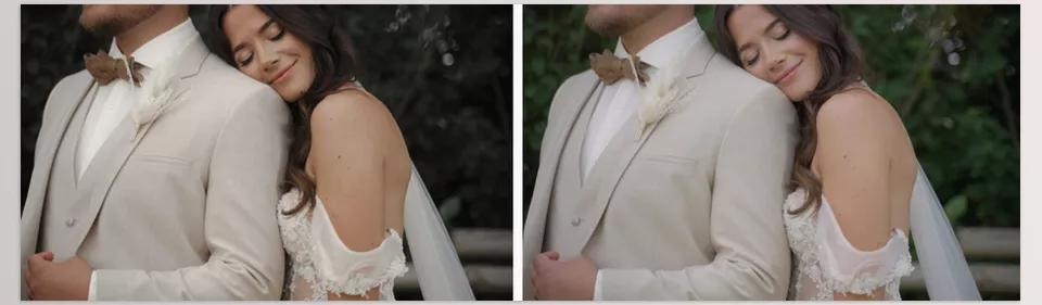
Marble 03: Bright, Clear, and Energetic ✨
Compared to the previous two versions, Marble 03 has a brighter and more modern appearance. The goal of this LUT is to create colors that are clean, vibrant, bright, and close to reality. So, if you don’t want the image to become excessively warm or dark, this version can be a better choice.
Colors in this Look become vibrant and vivid while maintaining good clarity. At the same time, blacks become deeper and more striking, increasing contrast and helping separate the image’s elements more clearly.
Marble 03 works well for projects that need a fresh, modern, clear look, such as promotional videos, branded content, fashion, lifestyle, or any project where you want colors to look lively and eye-catching without making the image feel overly cinematic or heavy.
Marble 04: Soft, Pastel, and Delicate 🌷
If you’re looking for a much softer Look, Marble 04 offers a different atmosphere. This version focuses on soft pastel colors, with relatively subtle color changes. A delicate Blush tint is also added to the image, giving the final result a softer and more delicate feel.
One of the interesting features of Marble 04 is that it can help in situations where intense lighting has made colors look overly contrasty or lifeless. By softening the overall feel of the colors, this LUT helps the image look gentler and more balanced.
You can use this Look for weddings, fashion, portraits, lifestyle, and bright and emotional projects, especially when you don’t want the colors to look too heavy or saturated and are looking for an elegant and sophisticated appearance.
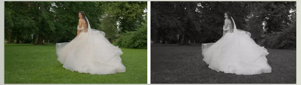
Marble 05: Black and White With Subtle Warmth 🎞️
Marble 05 is the only black-and-white version in the collection, but it isn’t designed to simply remove the color from the image and give you a basic Grayscale result. The image tonality is adjusted so that the final result remains balanced and harmonious, while a very subtle warmth can still be felt despite the black-and-white appearance.
The way this LUT handles highlights also gives the image a softer, more film-inspired feel—something close to the atmosphere of classic imagery and old films.
This version is an attractive choice for artistic portraits, documentaries, emotional projects, fashion, and videos that need a classic and timeless atmosphere. So, Marble isn’t only for creating color Looks; it also gives you a completely different option for when you want to go black and white.
It’s Not Just Five LUTs: Separate Color and Contrast 🎯
One of Marble’s most important features is that the collection isn’t limited to just 5 Primary LUTs. For each Look, you also get two separate LUTs: Isolated Color and Isolated Contrast. This means that for each of the five main styles, you have one version focused on color and another that separates the contrast changes.
This separation gives you more flexibility to create more personalized Looks. For example, you might like the colors of Marble 01, but its contrast might be too strong for your footage. In that case, you can keep the Color component and control the contrast separately. Or, conversely, you can use a specific contrast structure and combine it with the color from another version.
As a result, instead of having only 5 fixed appearances, you can use combinations of Primary, Isolated Color, and Isolated Contrast to achieve a result that better suits your own footage. This becomes especially valuable when different shots don’t have identical lighting and color, and you need to personalize the final Look slightly.
A Ready-to-Use Format for Editing Software 🎬
All LUTs are provided as .cube files, a common format supported by many editing and color grading applications. So, you won’t be dealing with a proprietary or restricted project or file; you receive the LUT files and can import them into your preferred NLE.
In addition, after purchase, the files are immediately available for download, and during Checkout, you can also create an account so you can access your download links later.
Overall, Marble is a collection with 5 completely different color personalities, starting with the warm and creamy Look of Marble 01, moving to the deep and earthy atmosphere of Marble 02, offering a bright and vibrant appearance with Marble 03, shifting toward soft pastel colors with Marble 04, and finally giving you a film-like black-and-white Look with Marble 05. Alongside these five styles, separate Color and Contrast LUTs are also included so you aren’t limited to the ready-made appearances and can adjust the final result more closely to your own footage.
A Few Tips for Making the Result Look More Natural 🎯
A LUT can change the overall appearance of your footage quickly, but for a truly professional result, it’s better to tweak the settings a bit rather than apply a LUT and stop there. A few simple tips can make the final output more visually pleasing and natural.
- Correct the lighting and White Balance first. Before applying a LUT, make sure the exposure and White Balance of your footage are balanced. Once the base color is correct, the LUT will produce a more predictable, natural result.
- Control the LUT intensity. You don’t always have to use a LUT at 100% intensity. By reducing the Opacity or Mix, you can make the Look’s effect more subtle and achieve a result that better matches your footage.
- Be sure to check skin tones. In Looks such as Marble 01 and Marble 04, changes to skin tones are an important part of the result. After applying the LUT, check the skin to make sure it hasn’t become excessively warm, pink, or saturated.
- Review each shot individually. A LUT might look amazing on one shot but may not produce the same result on another shot with different lighting or Exposure. After applying the LUT, review each shot individually and make minor adjustments if needed.
- Combine Color and Contrast intelligently. Don’t use the Isolated Color and Isolated Contrast versions only as alternatives to the Primary LUT. You can combine them so, for example, you keep the color of one Look while adjusting its contrast to better suit your footage.
Ultimately, the goal is for the LUT to be part of the color grading process, not to do all the work on its own. When you properly control the basic corrections and LUT intensity, it becomes much easier to achieve the same cinematic and consistent Look you’re after.
When Color Choice Becomes Part of the Story 🎬
Professional color grading isn’t just a technical step in editing; it’s an important part of the feeling the audience gets from the video. Choosing a warm, deep, pastel, or black-and-white palette can completely change a project’s atmosphere and give the images a distinct identity.
The Marble LUT Collection shortens this process with five different Looks—from the creamy, warm colors of Marble 01 and the earthy tones of Marble 02 to the vibrant look of Marble 03, the pastel colors of Marble 04, and the film-like black-and-white of Marble 05. In addition, Isolated Color and Isolated Contrast mean you aren’t limited to ready-made Looks and can adjust the result more closely to your preferences and footage.
Ultimately, Marble’s value isn’t simply that it gives you several ready-made LUTs; what matters is how quickly it helps you achieve a consistent, professional Look. Especially for projects where color plays a major role in conveying emotion, having several ready-made, customizable styles can eliminate much of the trial and error involved in color grading and leave you more time for the creative work itself.