

When the Photo Looks Good, but Something Feels Missing…
Are you familiar with the workflow of The Base Pack for Adobe by Cobalt Image? If you’ve worked with Lightroom or Camera Raw, this feeling is probably familiar: you take a photo that is completely acceptable in terms of lighting, composition, and even the captured moment, but when you start editing it, you notice a kind of inconsistency in the colors 😕 It feels as if what you see on the screen is not exactly what you saw in the real scene.
This usually reveals itself in small details; for example, the subject’s skin develops an unnatural color cast, reds become either overly sharp and intense or, on the contrary, appear dull and lifeless. It’s even interesting that when you shoot with two different cameras, the outputs may be so different that it feels like they weren’t captured from the same scene at all 📸
In this situation, many people quickly assume the problem is due to their editing or incorrect settings. However, a significant part of these differences doesn’t actually begin in the editing stage. Instead, it comes from the way the software “interprets colors” from the very beginning. In other words, before you even touch Curves or HSL, the image’s color foundation has already been defined in a particular way, and that foundation influences the entire final result 🎨
The Core Concept: What Does Accurate Color Mean?
When a photo is imported into Lightroom, the software has to decide exactly how each color should be displayed. In other words, how saturated red should be, what undertone the skin should have, and how color contrast should be distributed. This is handled by something called a Color Profile 🎨
If you want to think of it more simply, a color profile is like telling the software, “How should you see the world of colors?” This is exactly why photo output can vary dramatically between cameras—or even between profiles on the same camera.
For this reason, professional photographers are always looking for profiles that make color more accurate and predictable, especially in portrait work or commercial projects 📸
🧰 Traditional Approaches to Color Work
Under normal circumstances, most photographers rely on Adobe’s default tools and profiles to achieve their desired colors. Profiles such as Adobe Color or Adobe Standard are essentially the starting point of the editing process, and after that, all color correction is done manually.
Typically, the workflow looks like this: the image is imported into Lightroom, and then the photographer uses various tools to achieve the desired result. The most important tools used in this process include:
- White Balance for adjusting color temperature and removing unwanted color casts
- Curves for controlling contrast and color depth
- HSL for more precise adjustments of individual colors
- And in some cases, Presets to speed up the workflow
In reality, this method is similar to starting with a generic foundation and then refining it to approach the desired result through various adjustments.
⚠️ Limitations and Challenges
The main issue with this approach is that everything starts from the same generic foundation, while cameras, sensors, and even lighting conditions can create significant differences in color capture. As a result, you often have to spend a considerable amount of time manually correcting these differences, and even then, the outcome is not always completely predictable.
On top of that, skin tones are usually the most sensitive part of the process. Even the smallest adjustment can make them lose their natural appearance or look overly exaggerated 😬 This makes color editing feel more like a process of trial and error than a precise and controlled workflow. In larger projects—or when working with multiple camera systems—this issue becomes even more noticeable.
🚀 What Exactly Does The Base Pack for Adobe Do?
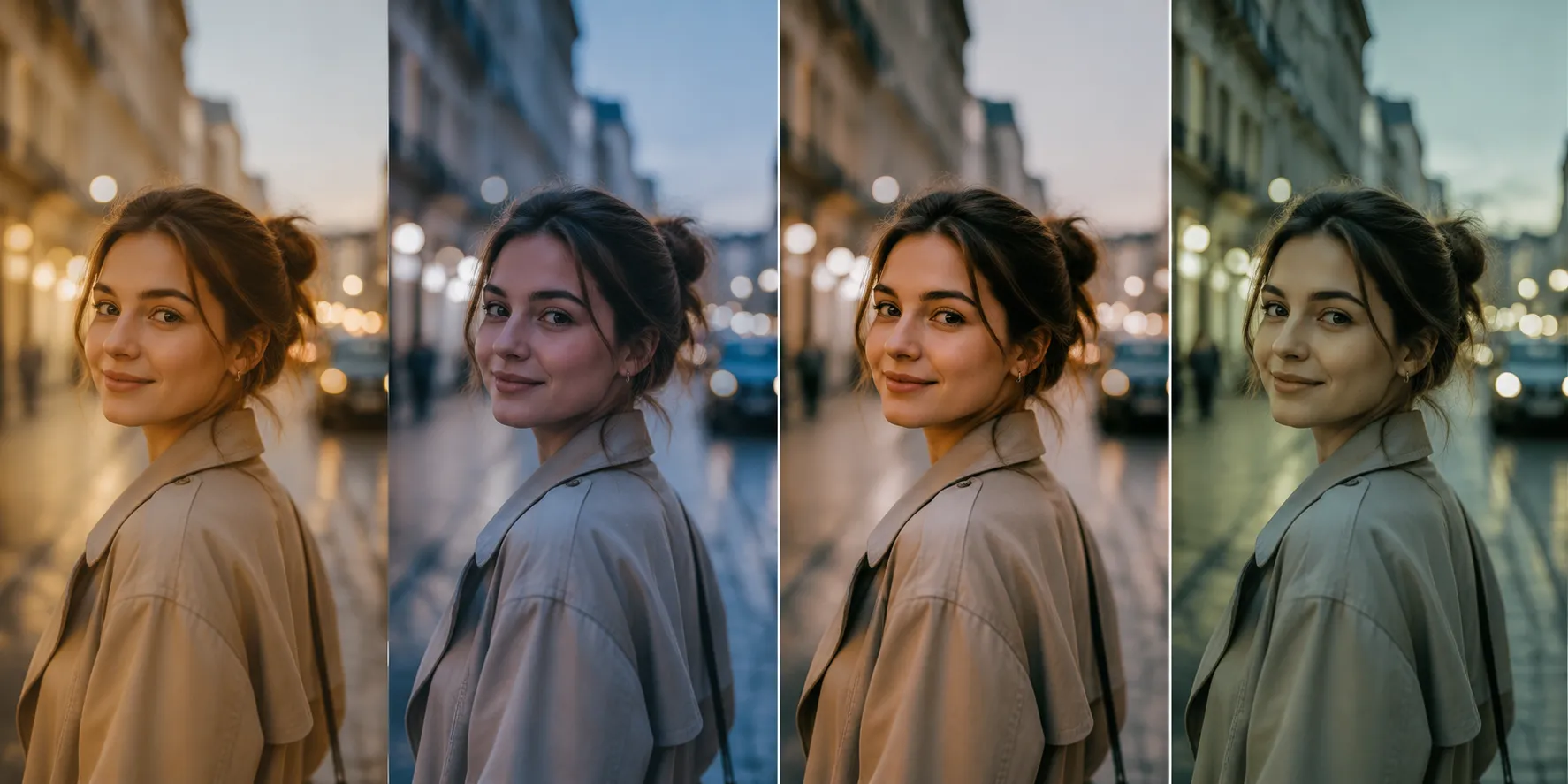
The Base Pack for Adobe is essentially a professional collection of calibrated Color Profiles for Lightroom and Camera Raw, designed to make the starting point of editing more standardized, accurate, and predictable. Instead of the software applying a generic interpretation of colors, this package provides a more controlled and engineered interpretation of image color 🎨
In other words, rather than starting your edit with raw, generic output, you begin with a more refined, accurate color foundation from the very first moment, making the editing process cleaner, faster, and easier to control.
🎛️ Features and Profiles Included in the Package
The Base Pack for Adobe is not just a single profile—it includes multiple modes, each designed for different scenarios:
- Cobalt Standard: A balanced mix of color, contrast, and accuracy; suitable for starting most projects
- Cobalt Neutral: More neutral and controlled colors for precise editing
- Cobalt Flat: A low-contrast output for those who want to build their edit entirely from scratch
- Cobalt Repro: Focused on maximum color accuracy; ideal for sensitive and professional work
Unlike filters or presets, these profiles do not force a visual style onto your images. Instead, they ensure that the image’s “color language” is defined more accurately from the very beginning.
🔥 The Key Difference: Profiles vs. Presets
This is one of the most important points that many people misunderstand.
Presets are collections of predefined adjustments applied after the image is opened. They modify things like exposure, contrast, HSL, white balance, and more, all at once, to help you quickly achieve a specific style. For that reason, presets mainly affect the final appearance of the photo.
Profiles (such as Base Pack), however, operate at a deeper level. Before any serious editing begins, they change the way Lightroom itself interprets color. Put simply, a preset says, “How should this photo be edited?” while a profile says, “How should this photo be seen?” 📸
This is why The Base Pack for Adobe is more of a foundational tool than a styling tool. It doesn’t create the final look for you—it simply ensures that your editing starts from a more accurate and reliable point.
⚡ What Does This Change Mean in Practice?
When you use these profiles, the biggest difference you’ll notice is in editing speed and control ⏱️ Many of the corrections you previously had to make manually are already handled more accurately from the start.
For example, in portrait photography, simply selecting the right profile can often give you more natural, balanced skin tones without needing to dive into complex HSL or Curves adjustments. This means that a large portion of sensitive color correction becomes easier right from the beginning.
In commercial projects—or whenever you’re working with multiple camera systems—this package also helps keep outputs more consistent and maintain a unified color identity. At first glance, this may seem like a minor benefit, but when your workload increases, the impact on time, quality, and consistency becomes very noticeable 🎯

🧠 Tips for Better Results
Before diving into the practical use of this tool, it’s worth knowing a few simple but important tips that can significantly improve your results. They’re not complicated, but they make a noticeable difference in the final outcome.
🎯 Choose the Profile Before Editing
It’s better to select your color profile before starting the editing process, not the other way around. This ensures that you have a more accurate color foundation from the start and makes decision-making throughout the edit easier and more precise.
📸 The Right Choice for Portraits
For portrait photography, Neutral and Standard profiles are generally safer choices because they keep skin tones more natural and controlled. Flat, on the other hand, is better suited for situations where you want to build everything from scratch and maintain complete control over the image.
⚙️ Recheck White Balance After Selecting a Profile
After selecting a profile, make sure to check your White Balance again. Changing profiles can slightly alter the software’s interpretation of colors, which may affect the overall temperature of the image.
Overall, these tips may seem simple, but they are exactly the kind of details that help you get cleaner and more professional results from The Base Pack for Adobe. When used correctly, the difference in editing speed and quality is immediately noticeable ✨
🚀 Why This Tool Can Change Your Editing Starting Point
Ultimately, The Base Pack for Adobe is not designed to replace editing skills or the photographer’s expertise. Instead, it serves a much more important role: it ensures that your image opens with a reliable, accurate color foundation from the very beginning. This means that instead of constantly guessing and correcting problems, you start from a point that is already logical and standardized 🎨
If you have experience with Lightroom, you know that a significant portion of editing time is spent correcting skin tones, controlling reds, and maintaining consistency across images. This is where a tool like this effectively becomes a professional shortcut—not by adding effects, but by eliminating part of the repetitive work and making the results more predictable ⏱️
Simply put, The Base Pack for Adobe helps you avoid spending your time “fixing color problems” and instead start from a workflow that naturally has fewer problems to begin with. And that small difference at the start ultimately translates into faster editing, cleaner results, and a more professional output. For someone who takes editing and photography seriously, this is no longer a luxury—it’s closer to being an essential foundation for the job 📸✨
If you are interested in color, we’ve created a complete, practical guide that also covers color grading. We highly recommend reading our guide to color grading—you’ll discover insights that can instantly improve your work.


