
When Creating a Professional Look Takes More Time Than You Expect 🎨
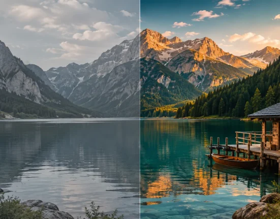
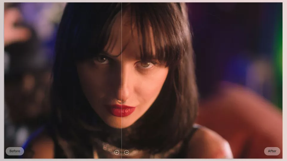
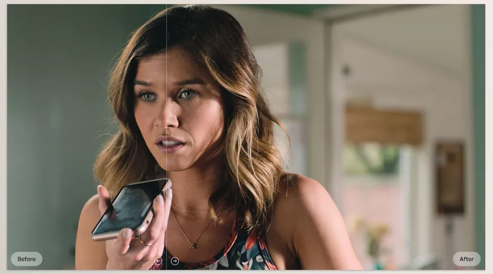
Are you familiar with the workflow of the CONTOUR Tool by Cullen Kelly Color? Have you ever imagined a shot with a specific color mood in mind, but once you started Color Grading, achieving that exact result took much longer than you expected? For example, you might want the image to have more cinematic contrast, deeper colors, and film-like shadows and highlights, while keeping people’s skin natural and preserving image details.
The reality is that creating a professional Look cannot be achieved simply by increasing Saturation or adjusting a few Curves. You need to create a balance between the colors, control different parts of the image, and make sure the style you have created works across every shot in the project. Something that may take only a few minutes on a simple image can take a significant amount of time when you are working on a complete project, film, or commercial.
This is where tools like Contour come in. It is a tool designed for creating cinematic Looks and professional Color Grading, helping you achieve the color mood you have in mind more quickly, rather than spending hours struggling with different settings, while also maintaining the same style throughout the entire project.

What Is Look Development and Why Is It Important in Color Grading? 🎨
Before getting into the different Color Grading tools and techniques, it is better to first become familiar with one of the most important concepts in this field: Look Development.
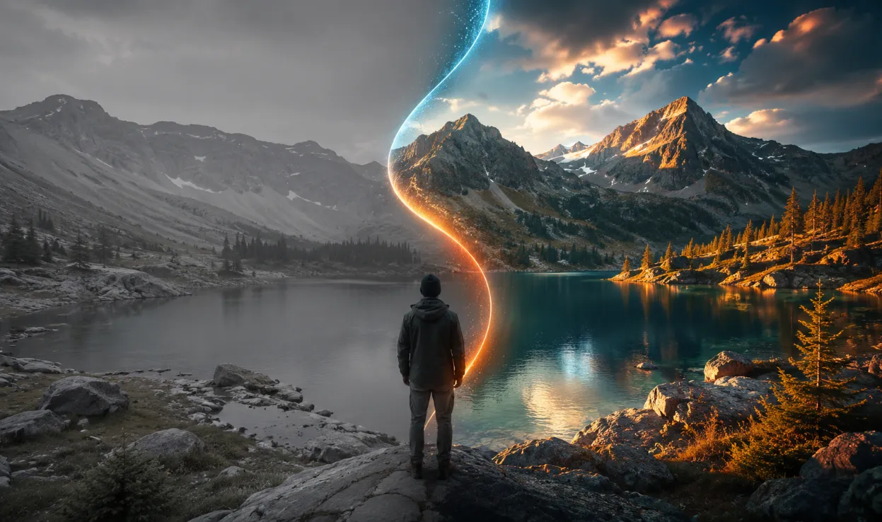
Simply put, Look Development is the process of creating the final appearance and feel of an image. It means determining the mood a video or film should have and what the audience should feel after watching it. This is the stage where you decide what kind of personality the colors, contrast, and overall visual atmosphere should have.
For example, a drama film may use cooler colors, deeper shadows, and stronger contrast to convey a more serious and intense feeling. For a memory-focused video, warmer colors, softer contrast, and a slightly vintage feeling may be added to create a more nostalgic atmosphere. Even in advertising projects, choosing the right Look can make a product appear more modern, luxurious, or energetic.
However, Look Development is not just about changing a few colors or adjusting an image’s brightness. The main goal is to create a specific visual identity for the entire project, so that all the shots look consistent when placed together and communicate the same overall feeling.
A good Look can:
- Make different shots appear more consistent.
- Communicate the story’s atmosphere and the image’s emotions more effectively.
- Give the project a distinct personality and visual signature.
- Make the final result appear more professional and impactful.
For this reason, professional colorists spend a great deal of time designing and creating the right Look, because colors not only change the appearance of an image; they are also part of the story and the experience the audience receives from a project.
Common Methods for Creating a Cinematic Look 🎨
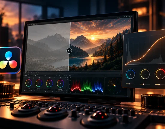
Before more specialized tools became available, most Color Grading work was done using the built-in features of editing and color correction software. Software such as DaVinci Resolve includes powerful tools that let you make almost any adjustment to an image’s colors and lighting to achieve a specific visual style.
Creating a professional Look usually involves combining several different tools:
- 🎡 Color Wheels: For controlling the color and brightness of shadows, Midtones, and Highlights
- 📈 Curves: For adjusting contrast and precisely controlling image brightness
- 🎯 Hue vs Hue: For changing specific colors without affecting the entire image
- 🌈 Hue vs Saturation: For controlling the intensity and saturation level of colors
- 🖌 Qualifier: For selecting specific areas of the image and applying more precise corrections
- 🎬 LUTs: For quickly applying a ready-made color style to a project
By combining these tools, you can perform a variety of adjustments. For example, you can make the image contrast more cinematic, correct specific colors, control shadows and highlights separately, or apply a suitable LUT to the project.
Challenges of Traditional Color Grading Methods ⏳
Although these tools are highly powerful, controlling everything is not always that simple when a project becomes larger and more professional. Imagine that you want to apply a specific Look to dozens or even hundreds of different shots. Each shot may react differently to the settings and require separate corrections. Sometimes changing one color affects other parts of the image as well, or increasing Saturation can make the image look overly artificial and unnatural rather than cinematic. For this reason, many colorists look for methods that provide precise control while also increasing the speed at which they achieve a professional, consistent result.
What Is Contour? A Tool for Creating Professional Cinematic Looks 🎨
Contour is a professional tool for Color Grading and Look Development that helps you create cinematic and professional color styles much faster than traditional methods.
The main idea behind Contour is to provide a simpler and more controlled path for designing a Look, instead of making you spend hours switching between different color settings, Curves, masks, and separate corrections.
With this tool, you can:
- 🎬 Control image contrast more precisely and cinematically.
- 🌈 Make colors deeper and more harmonious.
- 🎨 Create custom Looks for different projects.
- 💾 Save the styles you create as LUTs and use them in other projects.
- 🎯 Apply complex color changes without damaging other parts of the image.
Contour consists of several modules, each focusing on an important area of color design. Together, they help you create a complete and professional Look.
🎚 Curve Module: Creating Cinematic Contrast with More Control
Contrast is one of the most important elements of a cinematic image and has a major impact on the overall feeling of a shot.
The Curve Module in Contour lets you control image brightness more precisely and adjust different parts of the image more precisely, rather than applying only general adjustments.
With this section, you can:
- Make shadows deeper and richer.
- Keep Highlights softer and more controlled.
- Adjust Midtones to achieve a film-like feeling.
- Add more contrast to the image without damaging details.
One of the main advantages of this section is that the Curves are designed in a way that makes your changes less likely to create unwanted problems in other parts of the image.
🎨 Split Module: Creating Cleaner and More Natural Split Tones
Split Tone is one of the most popular techniques for creating a cinematic feeling in an image.
With this technique, you can, for example:
- Add a slightly cooler color to the shadows.
- Add more warmth to the brighter areas of the image.
- Create a more attractive color contrast between different parts of the image.
However, the problem with traditional methods is that the color may sometimes spread to unintended areas, such as people’s skin, neutral colors, or bright parts of the image.
Contour uses intelligent Saturation Masking to help you create a more controlled Split Tone. This means you can apply colors more strongly where they are needed without making the image look artificial.
The Subtractive controls in this section also allow you to more precisely determine how these changes interact with image contrast.
🌈 Saturation Module: Professional Control Over Color Saturation
Increasing Saturation does not always improve an image. In many cases, it simply makes the colors appear overly intense and unnatural.
The Saturation Module in Contour helps you manage colors with greater control.
With this section, you can:
- Adjust the color intensity in different parts of the image.
- Strengthen weaker colors.
- Create greater harmony between colors.
- Make the image more vibrant without creating a neon appearance.
This module provides three separate controls for different Saturation ranges, allowing you to adjust the relationship among low-, medium-, and highly saturated colors more precisely.
The Versus Sliders also help you separate colors more selectively and achieve greater depth and Dimension in the image within a few moments.
🎯 Hue Module: Changing Colors with Intelligent Control
Sometimes in Color Grading, you only want to change a specific color group without affecting the rest of the image. For example, you may want to slightly adjust the reds in the image, correct the sky’s tone, or shift a specific color palette across the entire project.
The problem is that with traditional methods, changing one color may also affect nearby colors. This is especially important when skin tones are involved, because skin is one of the most sensitive parts of an image, and even a small change can make the result look unnatural.
The Hue Module in Contour accounts for how the human eye perceives color, helping Hue adjustments appear more natural and precise. Its Saturation-dependent control also allows you to change highly saturated reds, for example, without damaging skin tones or other important parts of the image. This module is also compatible with various color spaces, including ACES, DaVinci Wide Gamut, and LogC3, providing greater flexibility for professional workflows.
🖌 Density Module: Adding Weight and Depth to Colors
Density is one of the important sections of Contour for creating cinematic Looks and adding greater depth to colors. This module helps certain colors have a stronger and richer presence in the image without making the final result look artificial, overly saturated, or affected by issues such as noise and color banding.
Using Density lets you gain more control over color behavior. For example, you can make specific colors stronger and deeper, change the intensity and presence of a particular color group, or make certain colors feel heavier and more cinematic. This control lets you work more precisely with each color’s personality rather than simply increasing the image’s overall Saturation.
One of the useful features of this section is the Versus controls, which allow you to adjust the behavior of colors separately across different ranges such as RGBCMY. The Focus option also helps you determine exactly which Saturation range should be affected by these changes, giving you more control over which parts of the image are influenced.
⚫ Split Saturation: Controlling Color Contrast Across Different Brightness Levels
Split Saturation is one of Contour’s unique features that help you gain more control over the relationship between color and image brightness. Unlike traditional methods that only adjust overall contrast or saturation, this section lets you control saturation separately in bright and dark areas of the image.
Using this module, you can make colors richer and deeper in darker parts of the image, slightly reduce color intensity in brighter areas such as Highlights, or create a more appealing balance between different sections of the image. This gives the image a more mature, cinematic feel without making the colors appear overly intense or artificial.
In fact, Split Saturation lets you control how colors appear across different areas of the image, rather than simply making the entire image more colorful. The final result is an image with strong, attractive colors that still looks natural, balanced, and professional.
💾 Creating LUTs from Your Designed Looks
One useful feature of Contour is that every Look you design can be exported as a LUT. This means you can save the color style you created using Curve, Saturation, Hue, and other sections, and reuse it later in other projects.
The workflow is very simple. First, you create your own custom Look, save it as a LUT, and whenever you need it, you can apply the same color mood to new shots or projects. This is especially useful when you have several projects with a similar visual style.
For colorists, filmmakers, and creators who regularly work on different projects, this feature saves a significant amount of time. Instead of starting from scratch each time and rebuilding the same settings, you can reuse your previous successful Looks to achieve a professional, consistent result more quickly.
In the end, Contour provides a faster, more controlled path to creating professional, cinematic Looks. The combination of tools such as Curve, Split Tone, Saturation, Hue, Density, and Split Saturation helps you achieve a specific color style more easily, without scattered settings, and maintain that style across different projects. Now that we’re familiar with the main features of this tool, let’s move on to a few practical tips to make the final Color Grading result more natural, professional, and impactful. 🎬
A Few Tips for Getting Better Results with Contour 🎬
Having a professional tool like Contour is only half the journey toward creating a good Look. What ultimately makes the result different is how you use the tool and the decisions you make during Color Grading. With a few simple tips, you can gain more control over colors and achieve a more natural, professional result.
- First, define the feeling of the image.
Before moving on to small adjustments, first decide what kind of atmosphere the project should have. Warm? Cool? Cinematic? Nostalgic? When you have a clear color goal, it becomes easier to decide which changes actually help improve the image. - Do not push the colors too far.
A professional grade does not always need to be highly intense or noticeable. In many cases, the best result is the one that communicates the intended mood while still looking natural and not feeling distracting. - Pay attention to skin tones.
If you are working with footage of people, keeping the skin natural is one of the most important signs of good Color Grading. When adjusting Hue or Saturation, always check that the skin tones still look realistic and balanced. - Save successful Looks.
If you achieve a good color style, save that Look as a LUT so you can use it more quickly later. This can save a great deal of time, especially for projects that share a similar visual style.
In the end, the best result is achieved when the tool and creativity work together. Contour can speed up the Look creation process, but it is your choices that allow the final image to develop its own feeling and personality. 🎨
🎥 When Colors Give an Image Its Personality
In the end, Color Grading is not simply about changing a few colors or making the image slightly more attractive. What makes a video memorable is the feeling and atmosphere communicated through the colors—the very thing that makes a scene appear warm, cool, luxurious, cinematic, or emotional.
Contour is designed for people who want to make the Look creation stage faster, more precise, and more professional. Instead of spending hours switching between settings and repeatedly making the same adjustments to achieve a specific result, you can gain more control over colors and more easily achieve the style you have in mind.
If a major part of your work involves images, films, advertising, or content creation, having a tool that simplifies the Color Grading process can make a significant difference. Contour helps you spend less time struggling with settings and more energy on the creative side of the project, storytelling, and creating a professional final result. 🎨
Whether you’re a beginner or an experienced DaVinci Resolve editor, learning how to use the right tools can significantly improve your workflow and save you valuable time. That’s why we suggest reading our complete guide to the most useful DaVinci Resolve tools.