

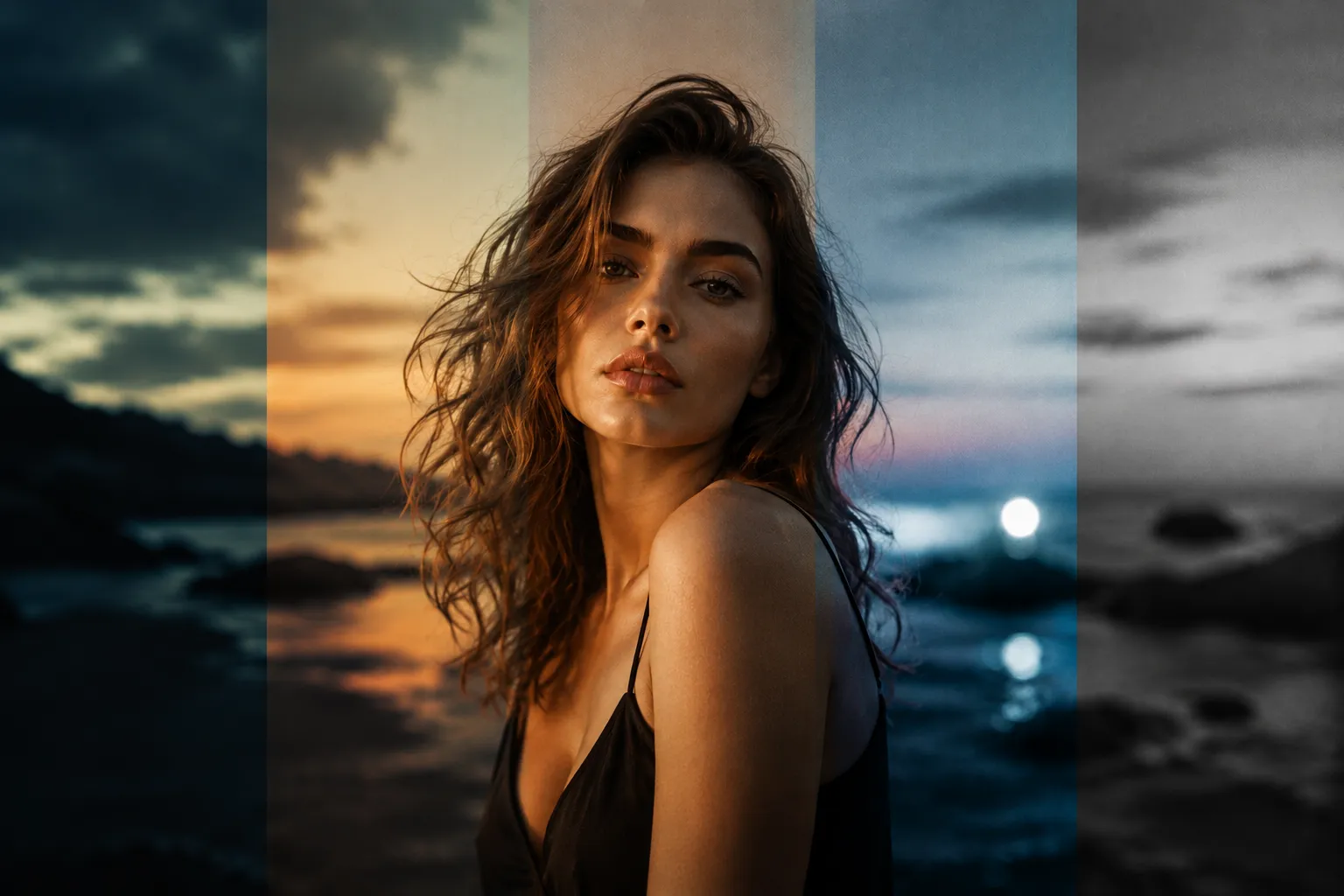
Ready-Made Presets Aren’t Enough; the Photo’s Style Matters More 🎨
Do you know the Dualistic Lightroom Presets by Mari Trancoso? Have you ever had a photo that was perfectly good in terms of lighting and composition, but no matter how much you adjusted the colors, you still couldn’t achieve that specific mood you had in mind? Photo editing isn’t just about moving a few sliders up and down; the combination of color, contrast, skin tone, and even how shadows are rendered can completely change a photo’s personality.
On the other hand, if you have to adjust everything from scratch for every photo, you’ll quickly spend a lot of time on repetitive tasks. This is where a few good starting points can speed up the editing process without forcing you to keep the final result exactly as the preset created it.

One Photo, Several Different Moods 📸
A Preset in Lightroom is essentially a collection of ready-made settings for photo editing. Instead of changing settings such as Exposure, Contrast, Highlights, Shadows, Color, and Tone individually every time, you can apply a preset and change much of the photo’s appearance in just a few moments.
But the main purpose of a preset isn’t just speed. Imagine you have several hundred photos from a wedding; some images were captured in natural light, some indoors, and others with Flash. Having several different styles helps you achieve a consistent look faster, then make the necessary adjustments to each photo.
On the other hand, a preset can also help you find your personal style. You might like a Film edit, but its colors may be too warm for your photo. By changing a few settings, you can keep the same idea while shaping the result according to your own taste.
Editing from Scratch; Possible, but Time-Consuming 😅
Before ready-made presets became this popular, almost all professional edits were done manually inside Lightroom. This method is still one of the best ways to learn the fundamentals of color and lighting, but when you’re working on a project with 50 or 500 photos, you quickly realize how time-consuming it can be. ⏳
The Traditional Editing Method in Lightroom 🎨
To build a style from scratch, you usually have to move between several different sections of Lightroom and adjust each one separately:
- ☀️ Basic: Adjusting lighting, contrast, highlights, and shadows
- 📈 Tone Curve: Controlling image depth and creating professional contrast
- 🌈 HSL / Color: Changing the color and saturation of each individual color
- 🎬 Color Grading: Adding color to shadows and highlights to create a cinematic feel
- ✨ Detail & Effects: Sharpness, noise reduction, Grain, and Vignette
By combining these tools, you can create almost any style, from clean, classic edits to film-inspired, cinematic looks.
What’s the Problem with Manual Editing? 🤔
Manual editing gives you incredible freedom, but it comes at the cost of time spent on each photo. When you have a large collection of images, maintaining consistent color and mood across all of them isn’t easy, and even the slightest change in lighting can force you to adjust the settings again.
On the other hand, creating a natural Film Look doesn’t happen just by changing a few sliders; you need to maintain the balance between skin tone, color temperature, contrast, and ambient lighting. That’s why many photographers prefer a smart starting point instead of a blank slate, then customize the edit to their own style.
Dualistic: a Preset Collection with Five Completely Different Styles 🎞️
When it comes to presets, many people imagine a few ready-made filters, but Dualistic by Mari Trancoso is more like a color grading system for Lightroom. This collection is designed to give you several different paths toward achieving your personal style instead of imposing one fixed look. 🌿
Dualistic Preset includes 21 professional presets organized into 5 main categories. Each category also includes several variations, so you have multiple versions of each style to choose from based on the lighting, location, and mood of the photo.
Cinematic: Photos That Tell a Story 🎬
If your goal is to create images with a film-like and storytelling feel, the Cinematic presets are made specifically for that atmosphere. This category controls colors, adds depth to the shadows, and adjusts contrast to give the photo a dramatic yet natural look.
This style is incredibly useful for projects such as wedding, Couple, Lifestyle, and outdoor portrait photography, where emotion and storytelling are more important than exaggerated colors.
Classic: a Timeless Style ✨
Not every project needs to be cinematic or filled with effects. Sometimes a clean, balanced, and natural edit is exactly what the client expects.
The Classic presets focus on maintaining a balance between lighting, color, and skin tone, producing results that are suitable both for printing and social media. If you’re looking for an everyday, versatile style, this category will probably be the one you use the most.
Film: An Analog Feel with Soft Colors 🎞️
The Film category is inspired by the feel of film photography, meaning softer colors, controlled contrast, and an atmosphere that feels slightly nostalgic.
The interesting thing about this section is that it isn’t meant to be used only on specific types of photos. Many photographers use Film presets as a base, then customize the final look for their project by adjusting White Balance or Exposure.
Flash: Designed for Flash Lighting and Modern Environments ⚡
Photos taken with flash behave differently in terms of color compared to those captured in natural light. Skin, highlights, and even the background usually require separate adjustments.
The Flash presets are designed for these conditions, making photos cleaner, more attractive, and ready to publish without losing the feel of flash lighting. This style is a very good choice for Editorial, Fashion, party, and nighttime photography.
Black & White: Focusing on the Emotion of the Image 🖤
Sometimes removing color is the most impactful editing decision. The Black & White collection doesn’t simply remove color; by adjusting brightness, contrast, and gray tones, it directs the viewer’s attention toward the lighting, form, movement, and emotion of the subject.
For emotional portraits, documentary moments, and photos where the story matters more than the color, this category is considered one of the strongest parts of the package.
4 Variations for Each Style; More Freedom of Choice 🎨
One key difference between Dualistic and many preset packs is that each category doesn’t contain just one fixed preset. Each group includes several different variations, so you don’t have to use the same result for every photo.
For example, two photos may both fall under the Cinematic category, but one may have been captured during sunset while the other was taken under cloudy conditions. In situations like these, you can switch between different versions of the same style and choose the closest result without having to start the edit from scratch.
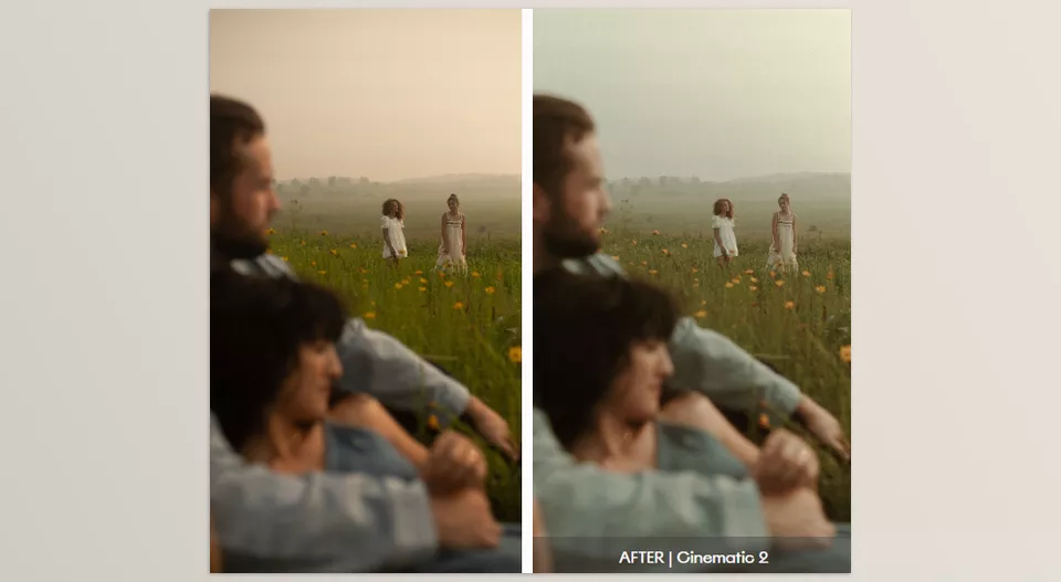
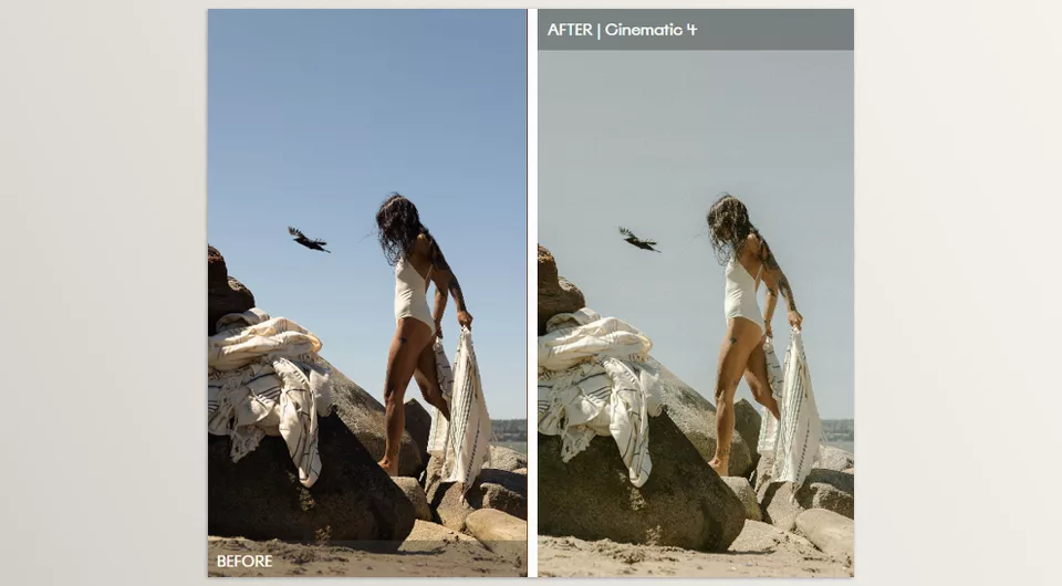
Breaking the Rules: The Idea Behind Dualistic 🎨
Although Dualistic organizes its presets into clear categories such as Cinematic, Classic, Film, Flash, and Black & White, these categories are guidelines rather than strict rules. Mari Trancoso designed the collection around the idea of duality—the belief that different, even contrasting, creative approaches can coexist.
For example, you don’t need to use a Cinematic style preset exclusively for portraits of drama or a Film style preset exclusively for an old film look. Try using each style across various subjects, lighting, and types of photography and see what interesting outcomes you can achieve. With Dualistic, photographers are encouraged to use the presets as a springboard for their own artistic expression instead of strict rules.
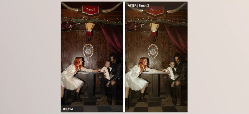
Establishing a cohesive look within photography is essential in professional image editing. Dualistic aims to push photographers to experiment with various artistic styles, including cinematic, classic, film, and flash styles. However, some photographers may prefer a more classic and natural style. In that case, other preset packs, such as Authentic Love Presets, can help you achieve consistency throughout a photo series. Using a preset style like this helps keep lighting, color, and overall feel consistent throughout the series, making it easier to produce a series that flows from the first image to the final.
How Can You Get a More Natural Result from a Preset? 🎯
No preset is supposed to complete a photo entirely on its own; the best edits come from using a preset as a Starting Point and then adapting it to the conditions of that particular photo. With a few simple changes, the final result can look much more natural and professional.
- ☀️ Fix the lighting first. Before applying the preset, adjust Exposure and White Balance as much as possible. A photo that is too dark or overly bright won’t produce an ideal result even with the best preset.
- 🎨 Don’t focus only on the preset’s name. You don’t necessarily have to edit a flash photo with a Flash preset. Sometimes a Film or Classic preset can produce a much more attractive result on the same image.
- 👤 Check the skin color again. After applying the preset, spend a few seconds adjusting the skin tone. Natural-looking skin color is always more important than any color style.
- 🖼️ Edit the photos together. If a project contains multiple photos, review them as a collection to make sure all the images have consistent color and lighting.
- ✨ Try the Variations. If the first option isn’t what you want, don’t immediately jump into heavy editing. Usually, one of the Variations in the same category will provide a better starting point.
Ultimately, remember that the purpose of a preset isn’t to eliminate creativity; it’s to reduce the time it takes to reach the result you have in mind. The more you customize the final settings to the photo’s actual lighting and environment, the more the final result will preserve your signature.
A Good Starting Point, Not a Predetermined Edit 🎨
The reality is that Dualistic isn’t meant to make all your photos look the same with a single click. Dualistic Preset is for when you want your editing process to move faster while still keeping complete control over the color, lighting, and final mood of the photo. ✨
With five different styles—Cinematic, Classic, Film, Flash, and Black & White—you have several options for every location and lighting condition. You don’t have to limit yourself to the category names either; sometimes the best result comes precisely from combining different styles.
If you’re one of those photographers who is always undecided between several different Looks and spends a lot of time experimenting, Dualistic Preset can be a very smart starting point. Apply the preset, make a few small adjustments, and ultimately arrive at an edit that, more than anything else, carries your own signature. 💛
If you enjoy the variety of looks in Dualistic but want to experiment with more distinctive editorial color grading, Quest 61 – Ombra is another collection worth exploring. While Dualistic offers styles ranging from Cinematic and Film to Classic and Flash, Ombra focuses on Split Toning, using different colors in the shadows, midtones, and highlights to create moodier, more character-driven images.