
When You Want to Give Your Photos an Editorial Color Style 🎨
Are you familiar with using the Quest 61 – Ombra Presets by Archipelago Quest? Sometimes a portrait, fashion, or editorial photo is completely ready in terms of lighting and detail, but after editing, it still looks like an ordinary photo. Especially when you want a specific color style for a fashion photoshoot, studio portraits, or a collection of editorial photos, regular adjustments like Contrast and Saturation alone aren’t enough. What you are usually missing is a specific Color Grade with character.
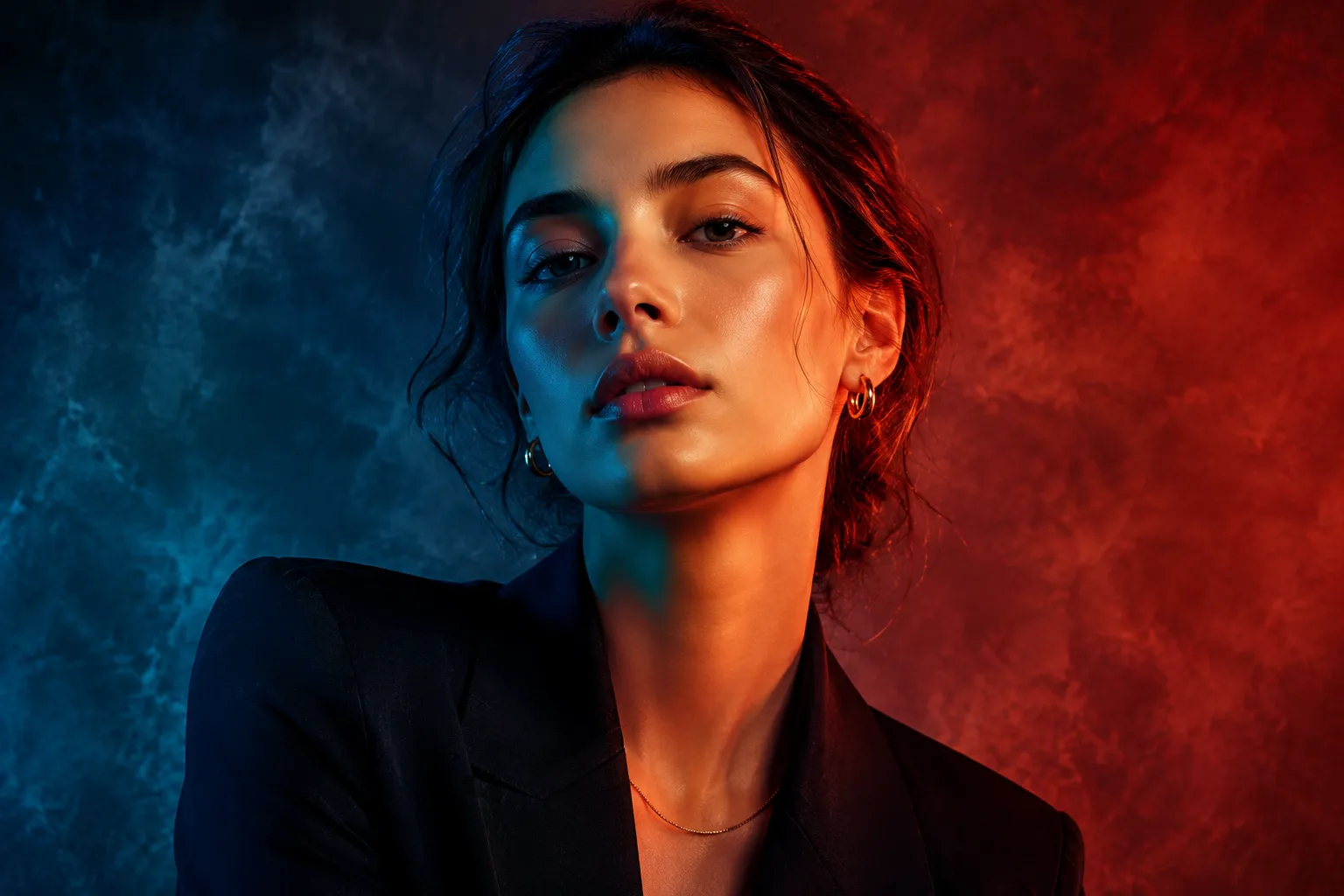
This is where separately coloring the shadows and highlights becomes important. For example, you can push the shadows of a portrait toward deep blue while keeping the lighter areas of the skin and clothing warm. Or, in a fashion photo, you can place red shadows alongside blue-green midtones to give the image a more graphic and editorial feel.
This type of editing especially shows its value when you want to edit multiple photos from the same project with a shared color mood. Instead of simply making each photo slightly brighter, darker, or warmer, you can have a specific color style that is recognizable from the first photo to the last in the collection; something that is really important for fashion, portrait, and Editorial photo series.

What Exactly Does Split Tone Do? 🎨
Split Tone, or color separation, is a method of adding different colors to the lighter and darker areas of an image. For example, you can push the shadows slightly toward blue while keeping the highlights warmer. The result is an image whose colors aren’t simply “good-looking,” but instead have deliberate contrast between different areas.
This technique is very useful for Editorial, Fashion, Portrait, and Lifestyle styles. Imagine a portrait with deep blue shadows and warm highlights, or a fashion photo where red shadows and blue-green midtones separate it from an ordinary edit. These differences help the image develop more visual identity.
You Can Do It Without a Preset; But How Much Trouble Is It? 🛠️
If you want to create this type of color grading without using a preset, the necessary tools are available in Lightroom and Adobe Camera Raw. The most important part is Color Grading, which allows you to control the colors of Shadows, Midtones, and Highlights separately. To make the result more complete, you can also turn to other settings:
- Color Grading: Adding different colors to the shadows, midtones, and highlights.
- HSL: Precise control over the Hue, Saturation, and Luminance of different colors, especially for correcting skin and clothing colors.
- White Balance: Adjusting the overall warmth or coolness of the photo to match the Color Grade.
- Contrast and Exposure: Shaping the tonal range of the photo so that the Split Tone can show itself better.
- Tone Curve: More precise control over contrast and shadow depth to achieve a more dramatic appearance.
The Main Problem: Creating a Consistent Look Takes Time ⏳
The issue isn’t just adding a few colors to the Shadows and Highlights; you have to coordinate the intensity of each color, contrast, exposure, and the photo’s main colors so the result doesn’t look artificial. On top of that, when you have multiple photos from a single photoshoot, the lighting and color conditions may differ slightly, and you may have to adjust the same settings again for each one. As a result, achieving a consistent, editorial Look can become time-consuming, especially when you need to edit dozens of photos in a specific style.
Quest 61 – Ombra: Three Different Takes on Split Tone ✨
Quest 61 – Ombra is a collection of photo editing presets from Archipelago Quest that focuses on the Split Tone technique, meaning colors are changed differently across different parts of the image’s tonal range. Instead of simply making the entire photo warm or cool, Ombra introduces different colors into the Shadows, Midtones, and Highlights, taking the image out of a neutral state and giving it a dramatic, graphic, and editorial feel. This collection includes 3 main presets, each with a different color personality.
Ombra 01: Cool, Deep, and Graphic 🧊
Quest 61 – Ombra 01 is the coolest preset in the collection and has a clear tendency toward deep blue in the shadows. The result is a graphic, high-contrast look that makes the difference between lighter and darker areas more noticeable. This option suits photos you want to look more dramatic and bold, with cool colors in the shadows playing an important role in shaping the image’s mood.
Ombra 02: A Bold Combination of Red and Blue-Green 🔥
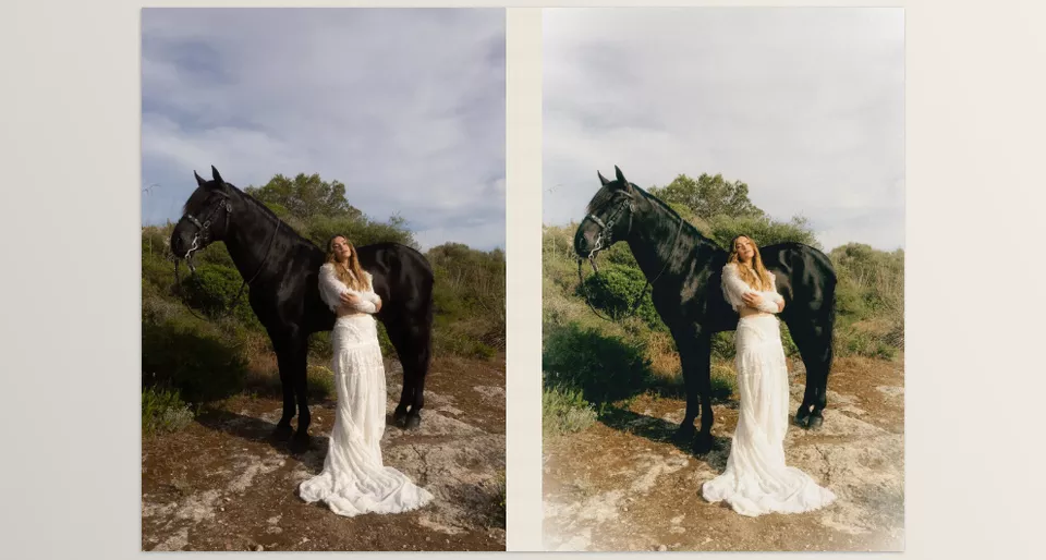
Quest 61 – Ombra 02 has a warmer mood compared to the first option and creates a different color combination. In this preset, the shadows move toward rich reds, while the Midtones take on a blue-green tendency. This contrast between warm and cool colors gives the image more visual personality and works well when you don’t want a completely neutral, natural edit and instead want the photo’s color grading to stand out more.
Ombra 03: Peachy and Balanced Warmth 🍑
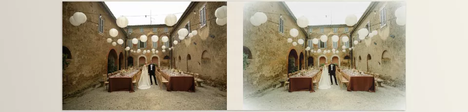
Quest 61 – Ombra 03 is the most balanced option of the three main presets and, instead of creating strong color contrast, introduces natural, peachy warmth into the image. This preset still uses the Split Tone concept and gives the photo a color personality, but the result stays softer and more natural than the other two options. So, if you want a specific style without aggressive color grading, this is a better choice.
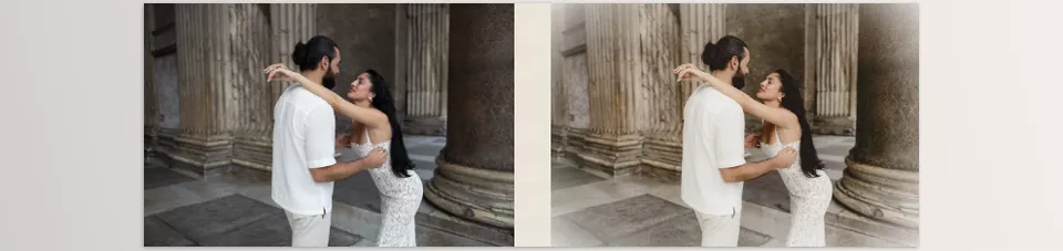
3 Complementary Tools to Take the Look Further 🛠️
Alongside these three presets, the Ombra collection also includes 3 complementary tools designed to further develop the same style. According to the product description, these tools let you take the Look created with the presets one step further and shape the result more to your photo. In the provided examples, Ombra is combined with tools such as Inverted Vignette, Creamy Highlights, and Underexposed Shadows, meaning the main preset can be paired with additional adjustments to highlights, shadows, and the image’s light focus.
Overall, Quest 61 – Ombra isn’t just a few presets with different colors; the main idea is to give you a specific, characterful color base and then let you shape that look further with complementary tools for your photo. The three main choices also offer three different directions: blue and graphic in Ombra 01, red and blue-green in Ombra 02, and peachy, balanced warmth in Ombra 03.
How to Get Better Results from Ombra? 🎯
The preset itself is only a starting point, and the final result depends on the lighting, colors, and mood of the photo. With a few simple adjustments, you can make the Split Tone look more natural and the final image more professional.
- First, adjust the light and white balance. Before applying Ombra, it is best to set the photo’s Exposure and White Balance as accurately as possible. If the photo is already too dark, bright, warm, or cool from the beginning, the preset’s color grading may produce a different result.
- Control the intensity of the color grading. If the colors or contrast become too intense after applying the preset, you don’t have to abandon the Look completely. Reduce the preset intensity so you can keep Ombra’s color personality without making the result too heavy.
- Check the skin color. In portrait photos, Split Tone can also affect skin color. After applying the preset, check the skin and, if the colors have changed too much, make minor corrections using HSL or a mask.
- Choose the right preset. Each of the three Ombra versions has a different personality; Ombra 01 is cool and graphic, Ombra 02 has a bolder combination of red and blue-green, and Ombra 03 is warmer and more balanced. Choose based on the lighting, clothing colors, the photo’s atmosphere, and the feeling you want to convey.
- Keep a consistent style for a collection of photos. If you are editing multiple photos from the same photoshoot or project, it is better to choose one version of Ombra as the base and then only change the minor settings for each photo. This will make the photos look more consistent when viewed together.
Ultimately, you are not supposed to edit all photos with exactly the same settings; what matters is keeping the main Look consistent while adjusting the details of each photo individually. This way, Quest 61 – Ombra’s personality is preserved, and the final result looks more natural and professional.
When Color Gives a Photo Personality ✨
If your photos are good in terms of lighting and quality but still lack that editorial, distinctive feel, Quest 61 – Ombra can be exactly what you are missing. Instead of simply making a photo warmer, cooler, or more contrasty, it lets you use three different styles to shape the colors of the shadows and lighter areas differently, creating a specific Look with personality.
On the other hand, manually achieving such a Color Grade can be time-consuming, especially when you want to apply the same style to a large number of photos. With three different presets, ranging from blue and graphic shadows to a red and blue-green combination and balanced peachy warmth, Quest 61 – Ombra gives you several ready-made starting points so you can reach the result faster and then only make the necessary adjustments to each photo.
So, if you regularly work with portraits, fashion, Lifestyle, or Editorial photos and want your images to have a specific color signature, Ombra can make the Color Grading process much easier. All you need to do is choose the right preset, match its intensity to the photo, and customize the final look with complementary tools; these changes can make photos not only “well-edited” but also give them a clear feeling and personality.
If you prefer a softer, more natural color style, the Warm and Organic Preset Collection is another option worth exploring. While Quest 61 creates a more distinctive look, Warm and Organic focuses on warm, earthy tones that give portraits, travel, lifestyle, and outdoor photos a natural and cohesive feel.