

When Choosing Colors Takes Longer Than Animating…
Have you ever created anything using the Coco Color CoWorker Plugin by aescripts? Sometimes in motion projects, the hardest part isn’t setting keyframes or building compositions — it’s choosing colors.
You sit down in After Effects with a clear idea, but the moment you try to place colors next to each other, everything slows down. You find a good color, but it dies next to the next one. You increase the contrast, and the image starts screaming. You reduce it, and readability disappears.
The truth is, color is the emotional backbone of a project. If it’s not chosen correctly, even the best animation won’t deliver the impact it should. And this is where color management shifts from being a matter of taste to becoming a professional decision.

Color Management in Motion; It’s Not Just About Looking Good
When we talk about choosing colors, we’re actually talking about a multi-layered decision — not simply “which color looks nicer.” Color in motion isn’t just for beauty; it needs to create harmony, maintain readability, communicate brand identity, and even consider audiences who may have color blindness. On top of that, it has to stay aligned with current visual trends so your work doesn’t feel outdated.
What does that mean? It means choosing colors is a balancing act. You need to create a balance between appeal and readability. Between creativity and standards. Between making your work distinctive and keeping it functional. If any of these fall out of balance, no matter how impressive the animation is, something will feel off.
When We Rely Only on Default Tools
The truth is, you can move forward using After Effects alone. There’s the Color Picker, you can manually build a palette, test a few colors side by side, and reach a result through trial and error. If we want ready-made palettes, we usually browse different websites, find something, and bring it back into the project.
The typical workflow often looks like this:
- Selecting colors with the default tool
- Manually building a palette inside the project
- Judging contrast by eye
- Searching separately for palettes or gradients
- Constantly refining through trial and error
These methods work, but they have one major drawback: they fragment your focus. You’re constantly switching between designing and adjusting colors. You estimate contrast visually, change gradients multiple times, and every new project means repeating the same process again.
In tight projects, these small details turn into wasted time and energy — especially when the deadline is close, and you need to make fast, confident decisions.
Coco Color CoWorker Plugin: When Colors Finally Fall Into Place
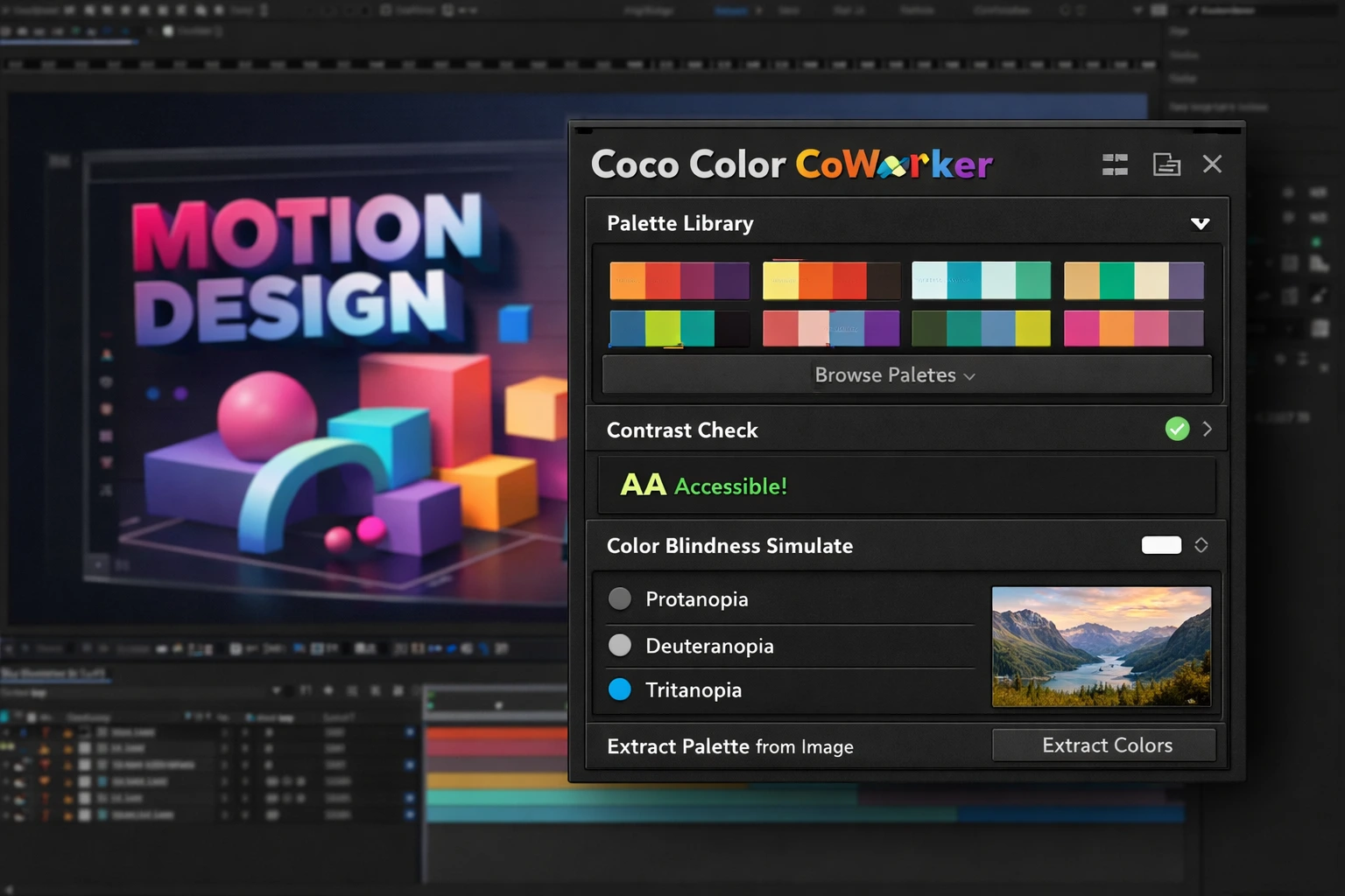
This is where Coco Color CoWorker Plugin comes into play — a plugin inside After Effects that isn’t just about handing you a few pretty palettes and calling it done. Its core idea is to turn color selection from a scattered, trial-and-error process into a structured and controllable system. Instead of browsing different websites, copying color codes, estimating contrast by eye, and constantly changing colors, everything happens directly inside your workspace.
That’s the difference: colors are no longer placed next to each other by chance; there’s logic and structure behind your choices.
Let’s take a closer and more practical look at its features.
Ready-Made Palette Library: Starting Without Getting Stuck
Starting from scratch is always hard — especially when you only have a general feeling in mind but no specific combination.
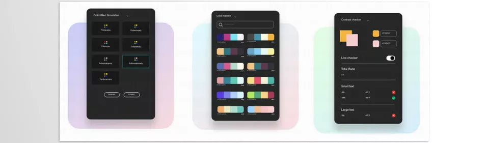
Coco Color CoWorker Plugin provides a large archive of ready-made and trending palettes. The result:
- You don’t have to start from a blank page
- You can quickly find the right mood for your project
- You encounter combinations you might not have thought of yourself
For social media projects, advertising work, or time-limited tasks, this means less stagnation and a faster transition into the real design phase.
Contrast Checker: A Logical Filter on Taste
Often, a combination looks good on your own monitor, but on mobile or smaller screens, it becomes unreadable — especially when you have thin text over a colored background.
The contrast checking feature helps you:
- Confidently verify readability before exporting
- Avoid low-contrast combinations
- Deliver advertising and typography projects more reliably
Here, you’re no longer relying only on “it feels right.” You have a clear standard.
Color Blindness Simulation: More Conscious Design
Around 9% of people have some degree of color blindness. That means part of your audience might see the world differently.
When you can view your work from their perspective:
- Your color choices become more conscious
- You act more confidently in public projects or large campaigns
- You gain a serious advantage with brands that care about accessibility
Here, color is not just a beauty tool; it becomes part of design responsibility.
Extracting Palettes From Images: Direct Inspiration Without Guesswork
Sometimes you have a reference image that perfectly captures the mood you want — the lighting, the atmosphere, the overall feeling. But translating that feeling into a usable palette isn’t always easy.
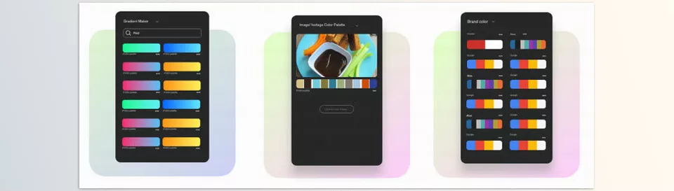
This feature extracts the main colors from the image and turns them into a ready-to-use palette. Its applications are clear:
- Aligning motion design with brand photography
- Creating visually consistent campaigns
- Drawing inspiration from nature or photography
Instead of guessing, you take color directly from the source of inspiration.
Gradients and Brand Colors; Speed in Serious Projects
If gradients aren’t crafted carefully, they can quickly make a design look amateur. On the other hand, finding the exact official color codes of brands can sometimes be a hassle.
Quick access to:
- Professional ready-made gradients
- Official palettes of well-known brands
Helps you move faster and more confidently in branding, product introduction, or advertising projects. Everything stays inside After Effects — no separate searching, no scattered copy-pasting.
In the end, Coco Color CoWorker Plugin isn’t just a set of color tools; it’s an organizer. It helps turn color selection from a scattered, taste-based process into a fast, verifiable, and professional decision. When colors have structure, the entire project feels more cohesive.
A Few Professional Techniques to Make Your Output Truly Look Professional
Having a good tool like Coco Color CoWorker Plugin is great, but the real difference lies in how you use it. If you keep these tips in mind while working, your output will feel one level more professional.
Make One Color the Leader.
From each palette, choose one dominant color, keep one or two complementary colors, and use one accent color for highlights. This makes your image feel organized and directed — not cluttered.
Deepen the Gradient Slightly.
With soft lighting, a subtle shadow, or very controlled noise, you can move away from a flat look. These small details make the work appear more professional.
Test at Real Scale.
Before exporting, view your work at a smaller size — especially for mobile. If the text is still readable and the accent color remains visible, you’re on the right track.
In Branding, Stay Within the Color Family.
Instead of adding scattered colors, play with lighter and darker shades of the main color. This preserves cohesion.
Ultimately, these tips help ensure colors are not just selected, but used consciously. It’s this small difference that makes your work feel calculated and professional.
When Color Choice Becomes a Conscious Decision
In professional motion graphics, color isn’t a momentary or random choice; it’s a decision-making system. Every color that enters the frame has a role: to attract attention, to build atmosphere, or to reinforce the message. The more structured and deliberate this system is, the cleaner, more professional, and more confident the final output appears.
Coco Color CoWorker Plugin helps establish that structure directly inside After Effects. Instead of jumping between multiple websites and tools or reaching results through lengthy trial and error, you have a clear framework that makes your choices faster and more logical. Your energy goes more into ideas and execution — not into wrestling with scattered adjustments.
If you often struggle with selecting palettes, adjusting contrast, or maintaining color harmony in your projects, this tool can make your workflow more cohesive and faster. Not to decide instead of you, but to help your decisions become more precise and more conscious — exactly what a professional output needs.
If you want to push your After Effects skills beyond the basics, our AE Tools guide covers practical tools and plugins that bring both speed and consistency to your work.