
🎨 When Digital Design Feels Too Clean, but You’re Looking for Something More Real
Have you had a chance to try the Retratone Plugin? In many graphic design projects—especially posters, covers, T-shirts, or even motion work—there’s a common issue: images often look overly smooth, clean, and digital. Everything is precise and sharp, but that sense of “real print,” “ink on paper,” or a raw, retro atmosphere is missing.
This is where many designers start using Halftone effects, print textures, or vintage simulations. The problem, however, is that creating these effects manually is both time-consuming and difficult to control consistently, and after using them a few times, the results often start to feel repetitive.
The real need is this: a fast, professional way to transform a digital image into something that looks like authentic print—with ink dots, precise color control, and the feel of traditional printing—without losing control of the process or making the result look overly artificial.

🧠 What Is Halftone and Why Is It Still Important?
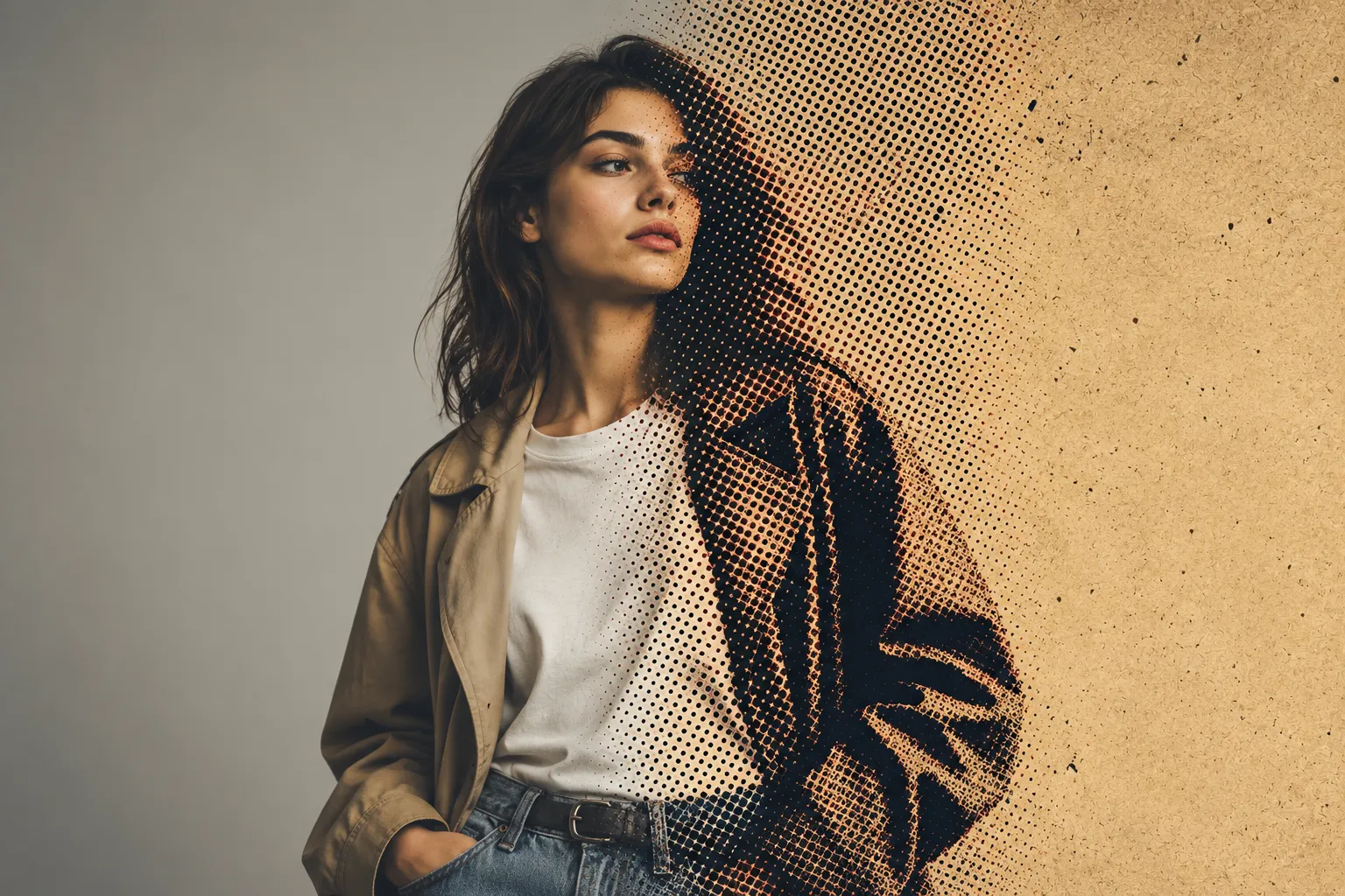
Halftone is actually a printing technique that creates images using tiny dots instead of smooth areas of color. The larger and closer the dots are, the darker the image appears; the smaller and more spaced apart they are, the brighter it looks.
For example:
- Old comic books 👀
- Retro posters 🎬
- Newspaper prints 📰
All of them are created using these dots.
This technique is still widely used in modern design because it can give images a nostalgic, vintage feel, create a unique, distinctive visual character, and ultimately help designs move away from looking flat, clean, and entirely digital by adding more organic, realistic texture.
🛠 Traditional Methods for Creating Halftone Effects in Photoshop
If you want to achieve this style without using a plugin, you’ll usually need to rely on tools and techniques that simulate the effect indirectly. These methods focus more on converting an image into a printed, dotted appearance rather than on providing a ready-made, controlled system.
The workflow usually looks something like this:
- Using the Filter Gallery and the Halftone Pattern effect
- Converting the image to Bitmap mode to create a dot structure
- Manipulating color channels and using Threshold adjustments to control highlights and shadows
- Or even manually building the effect using brushes, masks, and blending layers
Each of these methods covers only part of the process, and achieving a final result typically requires combining several techniques together.
⚠️ Limitations and Challenges of These Methods
The main issue is that these techniques are more experimental and manual than precise and controllable. This means that every time you try to recreate the effect, the output may vary slightly, and you may not have complete control over the details. In addition, many of these methods are not non-destructive, making it difficult to accurately refine them after the effect is applied. On top of that, achieving a polished and professional result often requires significant time spent testing and adjusting settings, which can be a serious limitation in fast-paced or commercial projects.
🚀 What Exactly Does Retratone Do?
This is where Retratone by Texturelabs comes into play. It’s not just another plugin; it’s a complete system for creating print and Halftone effects inside Photoshop, allowing you to transform a simple image into something that genuinely resembles real-world print.
Unlike standard filters that only change the appearance, Retratone works on the image’s structure. It gives you control over the colors, textures, and even the way the image is printed.
✳️ Key Features and Capabilities of Retratone
🎯 True Halftone with Complete Control
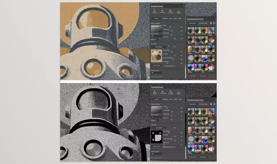
One of the plugin’s core features is its professional Halftone system. It converts images into dot patterns, but what truly matters here is the level of control. You can precisely adjust dot size, density, angle, and even the overall print feel, allowing your work to move away from a sterile digital look and get much closer to authentic print.
🎨 Ink System
This goes far beyond simply applying color; it feels as if you’re working with real ink. You can blend colors like layers of ink on paper, control transparency and overlap, and achieve a truly printed, analog aesthetic.
📦 Ready-Made Presets + Custom Style Creation
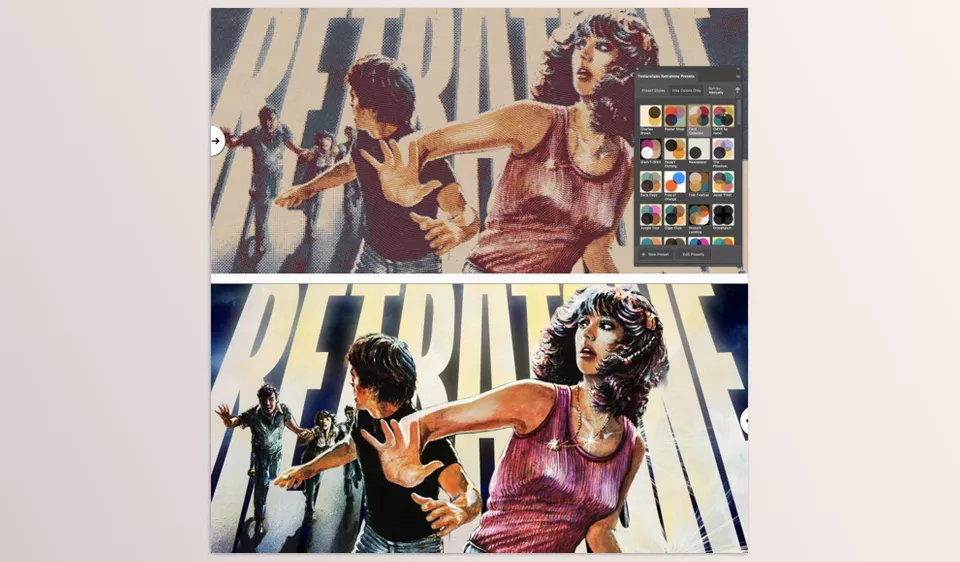
For a fast start, the plugin includes more than 100 ready-made presets covering a variety of retro, print, and graphic styles. More importantly, you’re not limited to them—you can create your own styles from scratch and make every project unique.
🧩 Layered Output (Ink Separation)
This is one of its most professional features. Retratone can separate an image into individual color layers, just like what happens in real printing processes such as screen printing or offset printing. This capability is extremely valuable for projects like T-shirt designs, posters, or physical print production.
🔄 Non-Destructive and Fully Editable Workflow
Every change you make remains editable. You don’t need to start over or worry about ruining your work. At any moment, you can go back, adjust the settings, and see the results update live.
📌 A Real-World Example
Imagine you’re designing a movie poster or a T-shirt graphic. Instead of spending hours manually creating Halftone effects and adjusting channels, Retratone allows you to produce, within minutes, a result that is both digitally polished and fully usable for real-world printing—a perfect blend of modern design and traditional print.
🎯 Tips for Achieving More Professional Results
To achieve cleaner and more professional-looking results, there are several simple yet important tips that can dramatically improve the quality of your output:
🎯 Start with Simpler Images
Busy and highly detailed images can make Halftone patterns look messy and difficult to read. The simpler the image, the cleaner the final result.
⚡ Increase Color Contrast
Boosting the contrast between highlights and shadows helps dot patterns appear more clearly and enhances the printed feel.
📦 Use Presets Intelligently
Presets are only a starting point, not the final output. It’s always a good idea to customize them afterward to avoid repetitive-looking results.
🎨 Limit the Number of Colors (2 to 4 Colors)
Using a limited color palette greatly helps create a more authentic retro print aesthetic and makes the final result feel more natural.
🔍 Check the Details at High Zoom Levels
Before exporting, zoom in and carefully inspect the dot density and pattern cleanliness to ensure everything looks correct.
Ultimately, these simple tips can transform your work from an ordinary effect into a professional, print-oriented design.
🧾 When Digital Printing Gains a Real Feel
In the end, Retratone is more than just a tool for creating Halftone effects; it’s a complete print design system that helps you move beyond conventional digital design and into a world of texture, ink, and authentic print aesthetics. A place where an image isn’t just seen—it is felt.
This small difference is what separates professional work from ordinary work. When you can give your designs a distinctive visual identity—not just through color and form, but also through texture and print character—your output no longer looks like everyone else’s. That’s exactly when tools like this become an essential part of the design process rather than simply another effect.
If your goal is to create work that is not only beautiful but also memorable, Retratone quickly becomes part of your workflow. It helps you create something that is both digital and infused with the authentic feel of print—and that combination is exactly what modern design often lacks.
Whether you’re a beginner or an experienced Photoshop editor, learning how to use the right tools can significantly improve your workflow and save you valuable time. That’s why we suggest reading our complete guide to the most useful Photoshop tools.