
When Ink and Paper Enter the Digital World 🎨
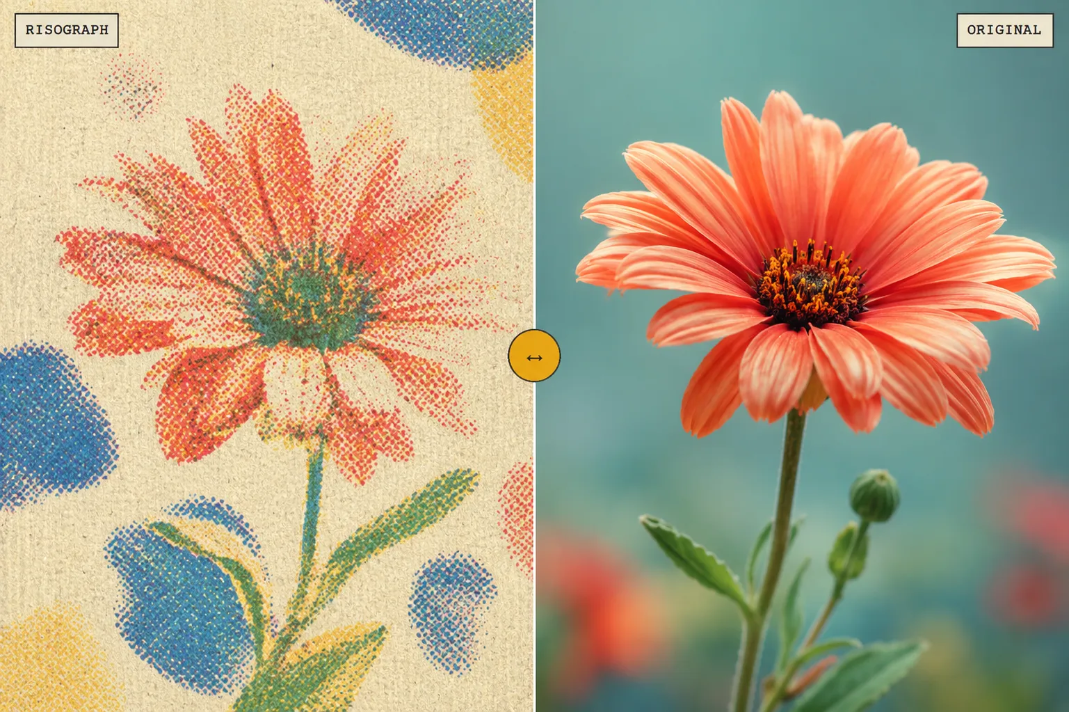
Are you aware of what the Risograph Plugin by aescripts does? If you’ve worked on poster design, graphic teasers, or retro-style motion graphics, you’ve probably run into this problem at some point: how do you recreate the distinctive look of risograph prints inside After Effects? Those layered colors, printed dots, slight misalignment between colors, and the texture that makes the image look as if it were actually printed on paper.
Creating this style cannot be achieved simply by adding a basic noise or halftone effect. What makes risograph printing appealing is the combination of several details: how the ink spreads, how the colors overlap, how certain areas print slightly lighter, and even how small printing-machine errors appear in the final result.
The problem is that manually simulating all of these elements inside After Effects can take a lot of time. You have to combine multiple layers, color effects, textures, and different settings just to get close to the desired result. This is where having a specialized tool for creating risograph printing can make the workflow much faster and more precise.

Risograph Printing: That Distinctive Handmade Print Feeling 🖨️
Risograph printing is a printing method that transfers an image onto paper using separate layers of ink. Unlike standard digital printing, where everything is expected to be completely precise and uniform, risograph printing is known for its small variations, such as slight color misalignment, changes in ink intensity, or the overlapping of multiple color layers.
What makes this printing style appealing is its unpredictable, handmade feel. When you look at a risograph design, you usually see flat colors, paper texture, printed dots, and small inconsistencies that make the work feel warmer and more authentic.
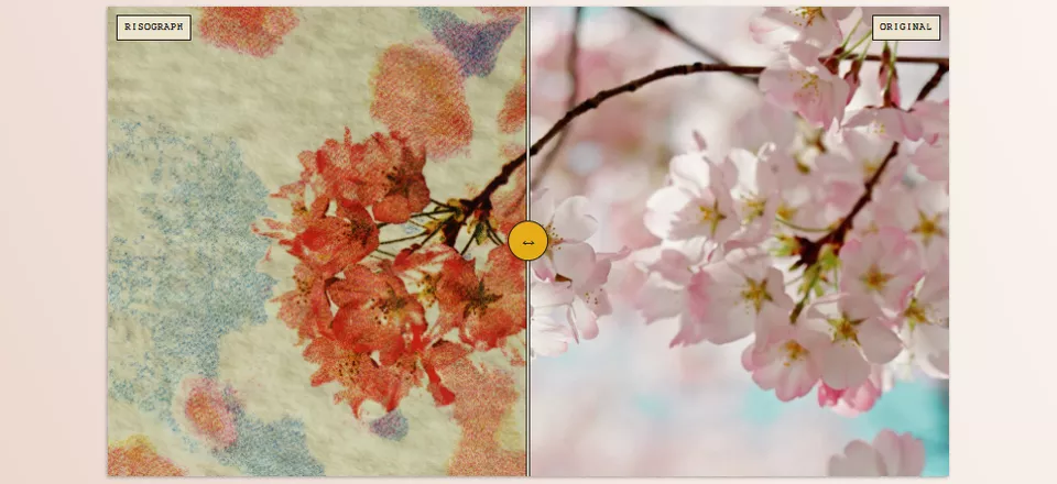
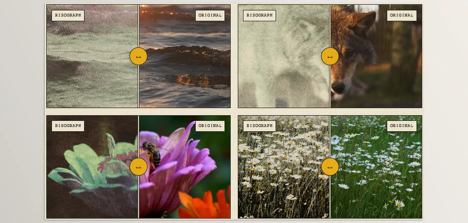
In motion graphics and digital design, the goal of simulating risograph printing is to bring that same feeling of real printing into the project. Instead of a perfectly clean, digital image, you get an output that looks as if it were actually printed on paper with ink.
Can It Be Done Without a Plugin? Yes, but It’s a Long Process! 🛠️
If you want to create this effect inside After Effects without dedicated tools, there are different methods you can use. You can combine several effects to gradually achieve a printed appearance.
Commonly used elements include:
- A noise effect to create texture
- A halftone effect to create printed dots
- Color adjustments to simulate ink
- Layer blending modes to make colors overlap
- Masks to create printing errors
- Distortion effects to create inconsistencies
However, the main problem is that creating a natural-looking result does not happen simply by adding a few basic effects. If you only place a noise layer over the image or add a few halftone dots, the result will look more like a preset filter.
What makes a print look real is the combination of several details: ink behavior, paper material, color interaction, and even the small mistakes that happen in real printing.
Risograph: When After Effects Turns into a Printing Machine ✨
Risograph is a specialized plugin for simulating risograph printing in digital projects. It helps you create the appearance of real print in After Effects without combining multiple effects. The main difference between this tool and standard effects is that it does not simply place an old or noisy look over the image. Instead, it attempts to simulate the entire printing process, from creating printing patterns and reproducing ink behavior to simulating paper texture and the natural errors of the machine.
Creating Different Halftones to Control the Printed Look 🎨
One of the most important parts of Risograph is its system for creating different halftones. In real printing, the image is transferred onto paper using small patterns of dots or lines, and the type of these patterns has a major impact on the final appearance.
With this plugin, you can choose between several halftone models, including dots, lines, stipple, blue noise, Bayer, Voronoi, and simulated color-diffusion models. Each of these modes gives the image a different feeling. For example, one model can create the look of old printed posters, while another may be more suitable for a modern or abstract design.
In addition to choosing the pattern type, you can also control details such as dot size, placement angle, spacing, intensity, and the way the dots are distributed. This means you do not just have a preset effect; you can actually shape the printed appearance to match the style of your project.
Controlling Inks Like a Real Printing Machine 🖨️
One of the things that makes risograph printing different is the distinctive behavior of its inks. In real printing, colors do not always sit next to one another as precisely and cleanly as digital pixels. Two colors may overlap, part of the image may receive more ink, or some areas may print slightly lighter.
Risograph simulates this behavior and allows you to work with different ink layers. You can control the opacity of each color, the coverage intensity, the way the colors blend together, and even how much the ink spreads across the surface.
This feature is especially useful for designs that use multiple colors. For example, you can create a two- or three-color poster in which the colors overlap like a real handmade print, rather than simply appearing as several basic digital layers placed next to one another.
Creating Natural Printing Errors and Appealing Irregularities 😄
One of the most appealing aspects of risograph printing is the small imperfections that occur during the real printing process. This tool allows you to introduce the same events into your project in a controlled way, so the result does not look overly clean and computer-generated.
You can add elements such as:
- Slight misalignment between color layers
- Uneven printing and reduced ink coverage
- Printing-machine roller marks
- Faded or shadowed printing effects
- Random variations in the ink surface
- Natural printing stains and noise
The interesting point is that these errors actually improve the result. Something that might be considered a problem in industrial printing becomes a visual feature in risograph design, giving the work a more authentic and handmade feeling.
Simulating Paper and the Printing Surface for a More Realistic Result 📄
For an image to truly feel printed, changing the colors alone is not enough. The material of the surface on which the image is printed is also an important part of the final result.
Risograph also provides control over the appearance of the paper and printing surface. You can adjust the paper color, surface texture, grain, subtle variations, and the way light reacts to the surface, making the image look more like a physical output.
You can even choose whether the final result is displayed only on a paper surface, whether the original image is preserved as the underlying layer, or whether only the ink layers are rendered. This is a feature that is highly useful for compositing, motion graphics, and more professional projects.
Presets and Ready-Made Settings for a Faster Start ⚡
If you do not want to create all the settings from scratch, Risograph also includes a collection of ready-made modes that can serve as a good starting point for a project.
The tool includes 29 print presets, 11 machine profiles, and a collection of ready-made ink colors that help you achieve different printed looks more quickly. After selecting an initial mode, you can still modify every detail and create your own custom appearance.
Fast Processing for Heavier Projects 🚀
Although simulating real printing involves many details, Risograph uses GPU-based processing to make the effect run more smoothly in motion and compositing projects.
This becomes especially important when you are working with video, animation, or high-resolution files and do not want to spend a long time waiting to see the result of every change.
Ultimately, what makes Risograph different is that it is not simply a ready-made “printing effect.” It is a complete system for recreating the feeling of print. From the smallest details, such as the type of printed dots, to ink behavior, paper material, and natural errors, everything can be controlled so you can create outputs that truly feel like printed artwork.
A Few Tips for Achieving a More Natural Result 🎯
Creating a convincing risograph effect is not just about enabling a few options and adding several textures. The real appeal of this style comes from balancing digital precision with the imperfections of real printing.
- Don’t overdo the imperfections.
The charm of risograph printing comes from the right amount of irregularity. If you add too much noise, too many stains, or excessive printing errors, the result will look cluttered rather than authentic. - Use fewer colors for stronger results.
Many of the best risograph prints are created with a limited color palette. Carefully combining just a few colors creates a more convincing printed look and allows the ink layers to stand out naturally. - Don’t add texture just to make it look old.
Texture should not simply make the image appear aged or damaged. Its purpose is to reinforce the feeling of real paper, ink, and the printed surface. - Animate subtle variations in motion projects.
If you’re creating motion graphics, slight texture movement, subtle ink shifts, or small printing variations can make the effect feel much more organic and alive. - Start with presets, then customize them.
Presets are great for speeding up your workflow, but the best results usually come from adjusting and personalizing them to match the style of your project.
Ultimately, the goal is not simply to make an image look like an old file—it is to recreate the feeling of a real printing process. The more control you have over imperfections, color, and texture, the more natural and professional the final result will appear.
When a Digital Design Starts to Feel Real 🎨
In creative projects, higher quality or more detail does not always make a piece of work feel more distinctive. Often, what separates one design from the rest is the feeling it communicates: making the audience feel that they are not looking at a cold, computer-generated image, but at something crafted and alive. The combination of ink, paper texture, and a small amount of controlled irregularity is exactly the kind of detail that can create this difference.
When you work with Risograph, you no longer need to spend hours combining multiple different effects just to get close to a printed look. From the very beginning, you can focus on what actually matters: creating a distinctive visual style for the project. Whether it is for an animated poster, a graphic teaser, or a different kind of design, this printed feeling can give the final output more personality and make it easier for the audience to remember.
The main value of Risograph is not simply in creating an old-looking effect. It allows you to move away from repetitive and overly clean digital aesthetics. If you want your projects not only to be executed correctly, but also to have their own feeling, identity, and visual signature, having a tool that gives you complete control over ink, paper, and printing details can create a major change in your design and motion graphics workflow.
Are you searching for a clear explanation of After Effects tools and how they are categorized? Our After Effects Tools guide covers the most common types of tools and helps you understand the differences between plugins, scripts, presets, and templates.