

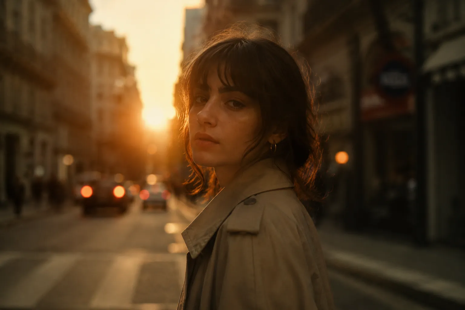
✨ Why Do Some Photos Have a Special Feeling?
Are you familiar with how the Frontier Presets work? Have you ever looked at a photo and unconsciously paused? Not because its lighting is simply good or its colors are perfectly balanced, but because there is something beyond that in it; an atmosphere, a feeling that seems suspended somewhere between reality and cinema. Some photos are simple, but they have an “emotional depth” that makes them stay in your mind for more than a few seconds. This is exactly where editing turns from a technical task into the creation of feeling.
The truth is, many photos fall short at this exact point. Each part of the edit has been done separately: the lighting has been corrected in one place, the skin tone somewhere else, and the contrast has been a momentary decision. The final result may be technically correct, but it lacks cohesion. In other words, the photo is good, but it does not communicate that “visual identity” or distinct signature. This is what makes some photos look professional, while others look clean and lack personality.
This is where the concept of presets and ready-made tools comes into play. These tools help you maintain a consistent visual language across all your work, rather than starting from scratch each time and making separate decisions for each photo. In fact, they give you a professional starting point; a place where, instead of getting caught up in basic settings, you go straight into shaping the mood and feeling of the image.

🎨 What Exactly Does a Preset Do?
Presets, in their simplest form, are collections of ready-made color and lighting settings applied to a photo so that, without lengthy manual editing, the image achieves a specific, predesigned style. In fact, instead of going into Exposure, Contrast, Color Grading, and all the other details yourself every time, you place a ready-made look onto the photo and then only fine-tune the details. This increases workflow speed while also preserving consistency in the outputs.
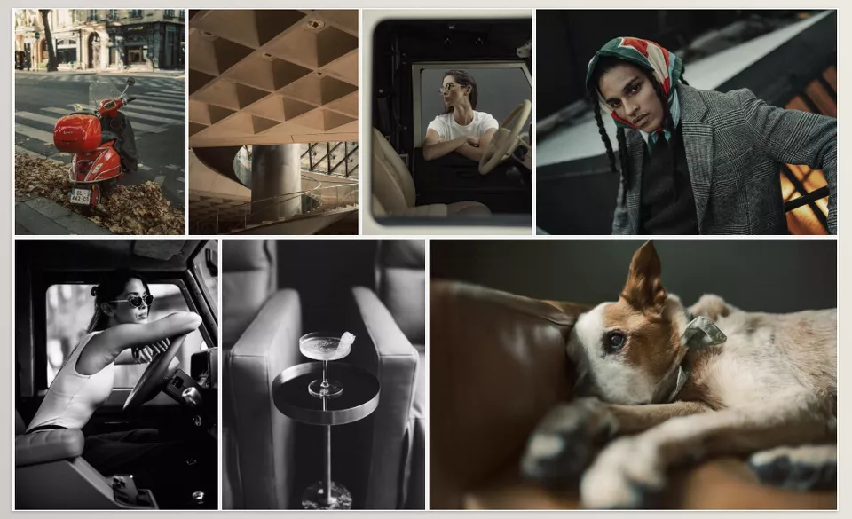
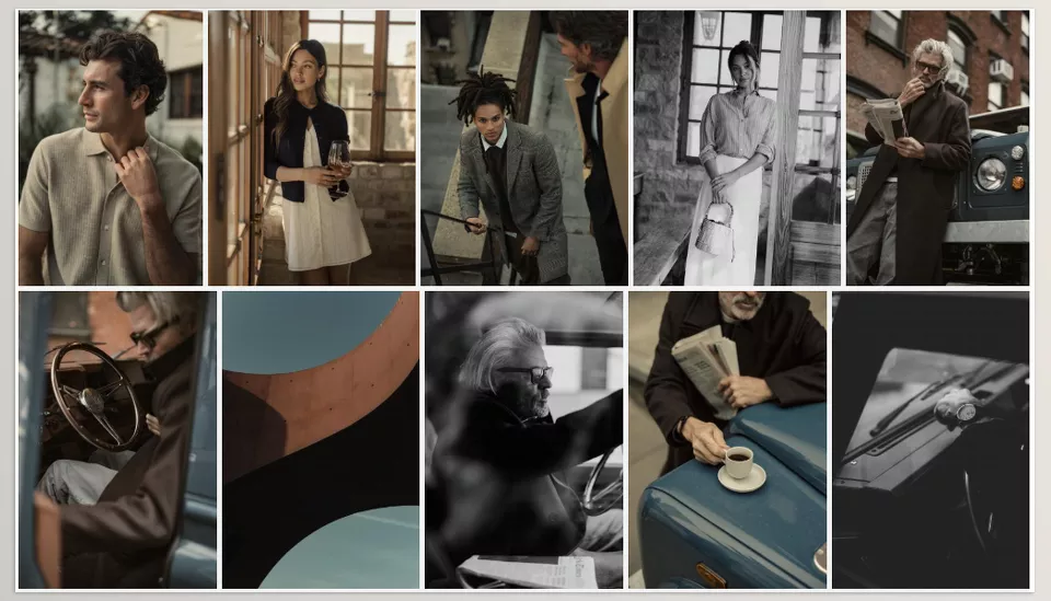
Frontier falls squarely into this category of tools, but its focus is not just simple beautification; its goal is to create a real, natural, and cinematic feeling. That means it helps portrait photos look warmer and more human, street photos gain a documentary and realistic atmosphere, and fashion or lifestyle photos look cohesive and professional without the colors becoming artificial or overly saturated. The result is that even an ordinary street photo can gain the mood of frames from an independent film with this preset.
🧩 Old Methods for Reaching the Same Result
If you want to achieve the same cinematic, cohesive atmosphere without a preset, you have to move almost everything forward manually, step by step. This means deciding separately for each photo where the light should be reduced or increased, how the colors should change, and which part of the image should be seen more. In this case, editing is more like creating a custom recipe for each photo rather than using a ready-made template.
Usually, this path includes the following steps:
- Manually adjusting Exposure and Contrast to control the overall light
- Working with the Tone Curve to create soft or cinematic contrast
- Correcting HSL for precise control of each color, especially skin and background
- Color Grading to adjust the overall feeling of shadows and highlights
- Masking the subject and background to separate the important elements of the image
⚠️ Challenges and Limitations
The main problem with this method is that it is completely dependent on experience and personal vision. This means that if you have not yet reached visual maturity, inconsistency can easily appear between photos: one photo may come out warmer, another colder; one may have high contrast, and another may be completely flat. In addition, every time you have to decide from scratch what should change, the editing process becomes both slower and more tiring. In the end, reaching a “consistent style” also becomes difficult because instead of dealing with a clear system, you are mostly dealing with a collection of scattered decisions.
🚀 What Is Frontier and What Does It Do?
Frontier is a professional preset collection for Lightroom, not created solely to make photos “more beautiful”; its main goal is to give images a distinct visual identity. This means that when you place several different photos side by side, you feel that they all come from the same world, with a shared color and lighting language. This is exactly what usually makes a professional project look cohesive and recognizable.
🎨 Main Styles (Color Presets)
One of the most important parts of Frontier is its collection of color styles, each designed for a specific mood. These are not just simple color changes; each one adds a kind of “feeling” to the image.
🌾 Dust
Dust focuses more on naturalness and the real feeling of life. The colors become warmer and more earthy, but not exaggeratedly so. In fact, the result it produces is similar to photos that still preserve their raw, momentary feeling. The skin looks very soft and real, and the image takes on an intimate, tangible mood.
🌵 Agave
Agave is one step more professional and controlled. This preset tries to keep colors balanced, especially displaying greens and blues in a more cinematic way. The final result is a clean, calculated, and slightly more film-like image that works very well for street or fashion work.
🔥 Ember
Ember has a more serious and dramatic atmosphere. Here, the shadows become deeper, and the contrast acts a little more boldly. At the same time, color control is still preserved, but the image gains a heavier, more emotional feel, which suits night photos or emotional portraits better.
⚫ Black & White Styles
The black-and-white section of Frontier is not just a simple conversion to grayscale; each style uses a different approach to light and contrast.
Bone
Bone produces a very clean, soft output. Its focus is on preserving skin details and textures without making the image overly harsh or heavy. The result is a simple yet elegant black-and-white look that is excellent for light, minimal work.
Iron
Iron is a little more structured and professional. The contrasts become clearer, giving the image a more classic feel. This model is more reminiscent of documentary styles or Leica cameras that place a strong focus on light and form.
Obsidian
Obsidian is the most intense mode in this collection. Here, the shadows become much deeper, and the highlights appear with greater intensity. The result is a very emotional, dramatic, and heavy image that is mostly used for artistic work or special portraits.
⚙️ Supporting Tools (Modifiers & Enhancements)
One of the things that sets Frontier apart from a simple preset is the presence of supporting tools that let you quickly adjust the image’s feel without navigating complex settings.
Modifiers are actually a kind of quick control over the atmosphere of the photo. For example, with a simple change, you can make the image slightly warmer and brighter, or, conversely, move it toward a colder, calmer atmosphere. This allows you to change the overall mood of the photo without touching the main settings.
Alongside that, there is also the Grain tool, which, by adding a very subtle texture, reduces the digital feeling of the photo and gives it a more film-like mood. These small details are usually exactly what make a photo “look more professional.”
🤖 AI Masking & Workflow
One of the more practical parts of Frontier is its smart masking tools. These tools help the subject automatically separate from the background without manual masking. After separation, you can control the light or contrast of each part individually and guide the image’s focus more precisely.
Alongside it, an educational workflow is provided that shows the correct way to use the presets. This section helps you not only use the preset but also understand how to achieve a cohesive, professional output with it.
💡 Important Note About Frontier
The key difference of this collection is that its outputs are not fixed or locked. That means it is not supposed to turn the photo into a repetitive result. In fact, it acts more like a professional base that you start from and then continue working on according to your own taste, so that both editing speed increases and your own personal visual identity is preserved.
🧠 Professional Tips for Better Use
If you want to get the best output from Frontier or any similar preset, you only need to follow a few simple but important principles; these small details are what turn the final result from “an ordinary edited photo” into “a professional and cinematic image.”
🌤️ Do Not Ruin the Natural Light
Before going to the preset, try to make the photo’s initial lighting as natural and accurate as possible. Presets are meant to enhance the feeling, not completely fix bad lighting. The cleaner the input is, the more professional the output will be.
🎛️ Only Fine-Tune the Main Settings
After applying the preset, instead of touching everything, focus only on Exposure and White Balance. These two usually have the greatest effect on the final feeling of the image, and the preset has already handled the rest of the settings well.
🌫️ Add Grain Very Carefully
If you want the photo to have a more film-like, realistic mood, Grain is a good option, but do not overdo it. A small, subtle amount of it adds depth to the image without compromising its quality or sharpness.
🤖 Use AI Mask for Better Focus
When you have a subject in the image, using a smart mask helps you work separately on the subject and background. This way, you can guide the viewer’s eye more precisely and give the photo more depth.
🔁 Stay Loyal to One Consistent Style
For your work to look cohesive and professional, it is best to use one or two specific presets consistently. This gives your outputs a distinct visual signature, rather than each photo having a separate style.
In the end, presets are only a quick start, not the whole path. When you use them correctly, they help you focus on creating the feeling and story of the image rather than getting bogged down in complicated settings.
Why Are Tools Like This Important?
Frontier and similar presets may at first seem like just a simple tool for changing color and light, but in practice, they are far more than a ready-made effect. They actually work like a “pre-designed visual language” that helps photos not just be edited, but have a specific, cohesive, and recognizable feeling; something that, in professional work, is exactly the point of distinction.
When you work without such tools, each photo becomes a separate project with its own decisions, from lighting and color to contrast and the overall feel of the image. The result may be good, but it is usually not cohesive. Frontier reduces this gap and gives you a fixed base so that, instead of getting caught up in redoing each photo, your focus stays on building your “personal style and visual signature.”
In the end, it is a choice between two paths: either you enter the editing details from scratch every time and spend a lot of time and energy, or you use a ready-made system that both speeds up your workflow and makes your outputs look more professional and harmonious. Frontier is built exactly for the second path—to help you start from a correct and professional point instead of starting over.
If you enjoy Frontier’s cinematic and cohesive look, you may also appreciate Disposable Camera Presets. Instead of polished cinematic tones, they focus on nostalgic film colors, authentic grain, and the imperfect charm of classic disposable cameras. Explore them to discover a completely different visual mood for your photography.